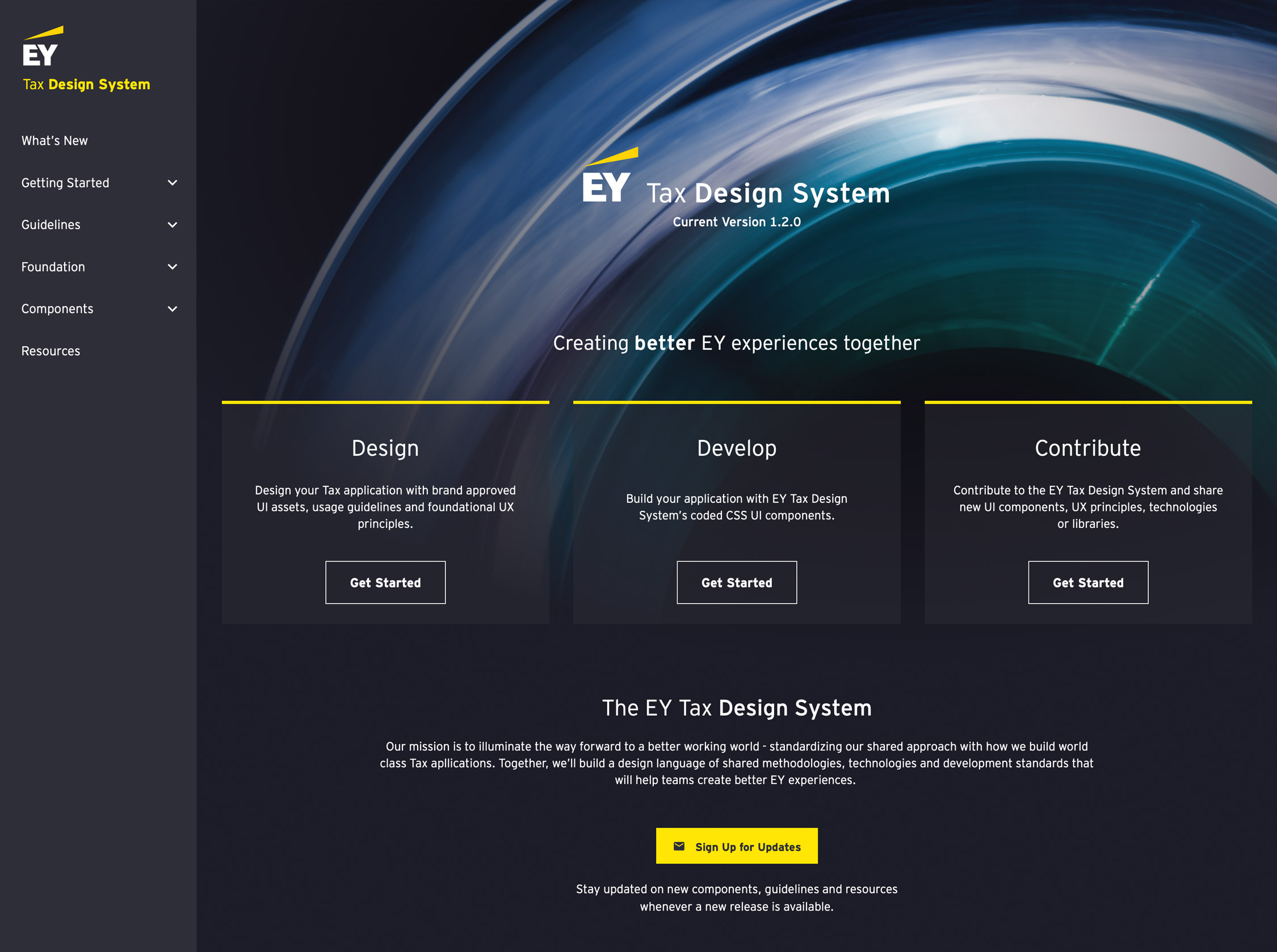
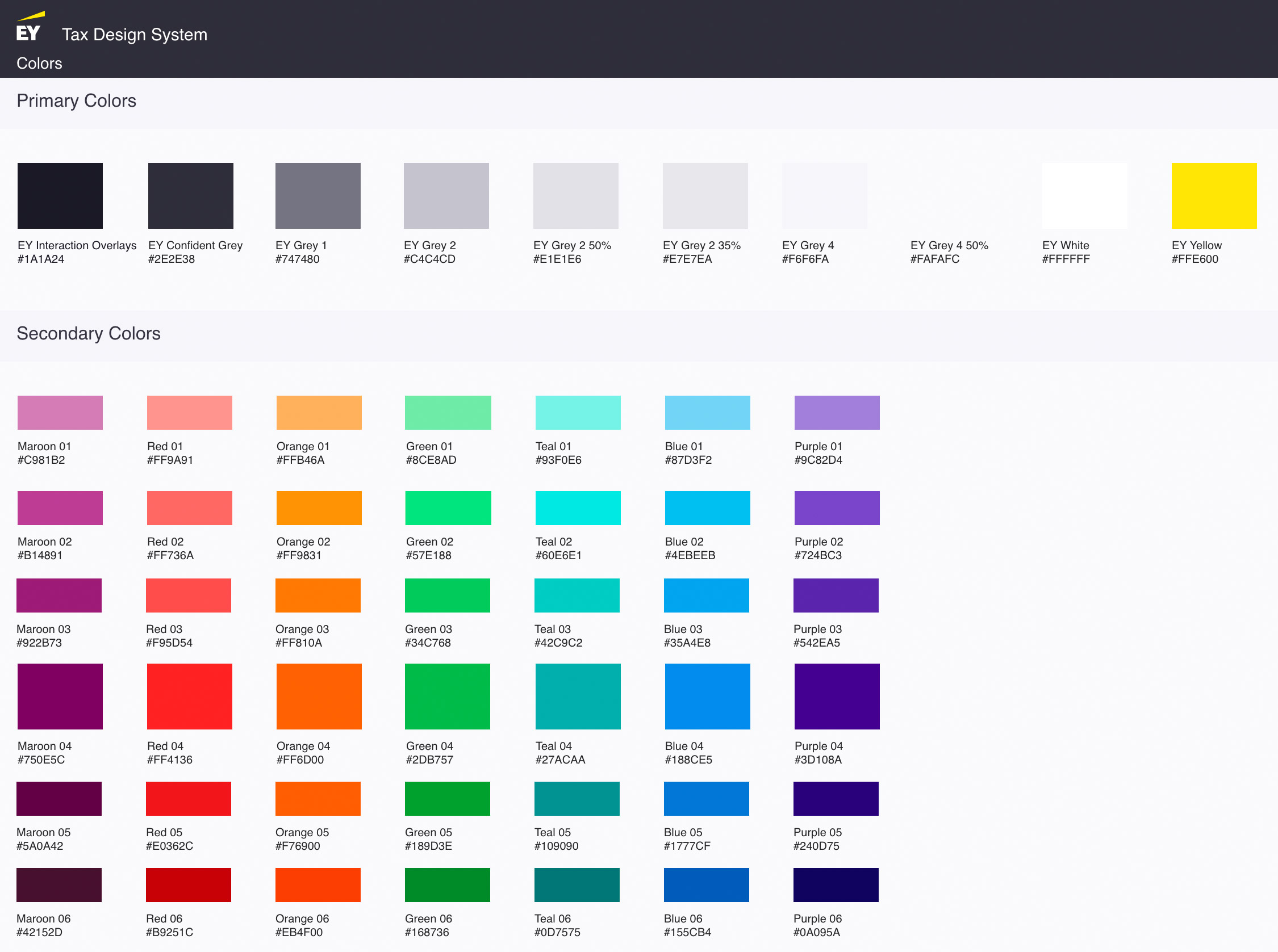
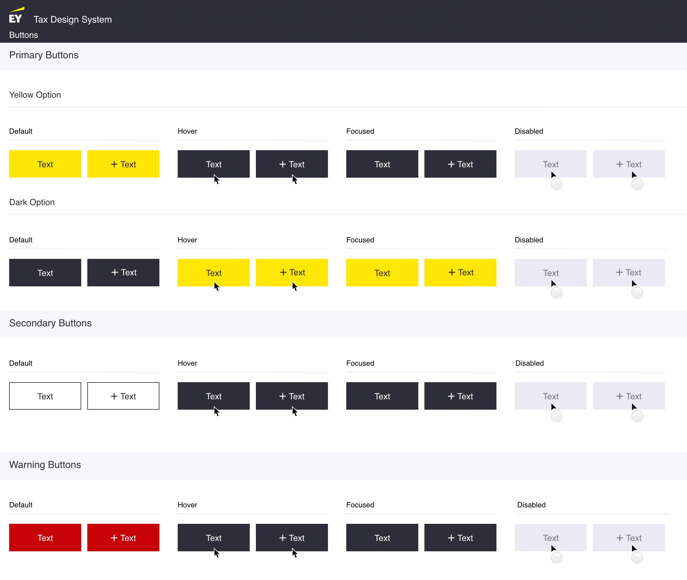
Ernst & Young Design System
UX & UI // Fintech
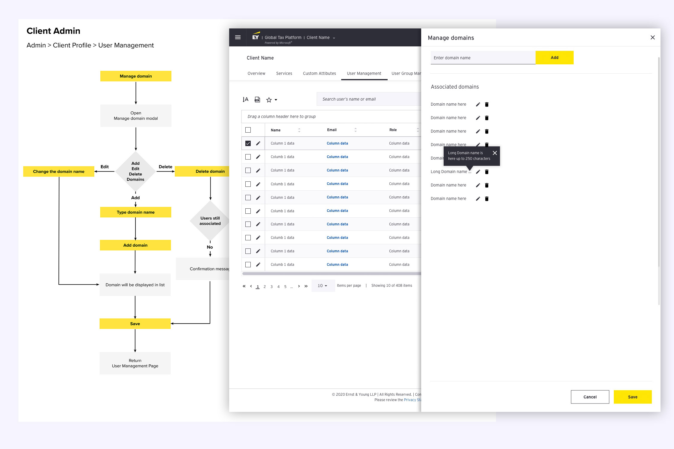
Design system for a global tax platform.
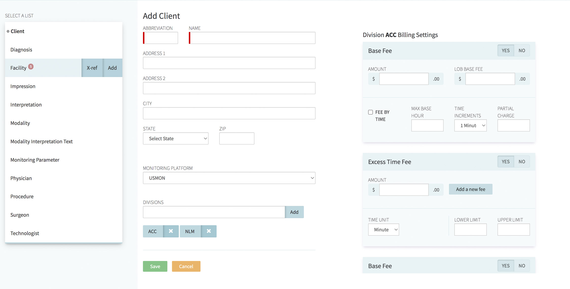
This project was the development and introduction of a centralized atomic design system for a globally used tax application. The goal was to ensure consistency during maintenance and new development, while allowing for rapid prototyping. In addition to visual examples and usage guidelines, the design system also offers design tokens and components (coded in basic HTML/CSS, React, and Angular.) It is currently in use globally by designers and developers. This system was designed using Sketch, Adobe XD, and Figma. The artifacts and components can be used by designers and developers alike. I was part of the internationally distributed project team in Asia, North America, South America, and Europe.
Neumapp
Creative Direction / Branding / UX & UI // Healthcare
Branding, naming and design of a medical project managemant application.
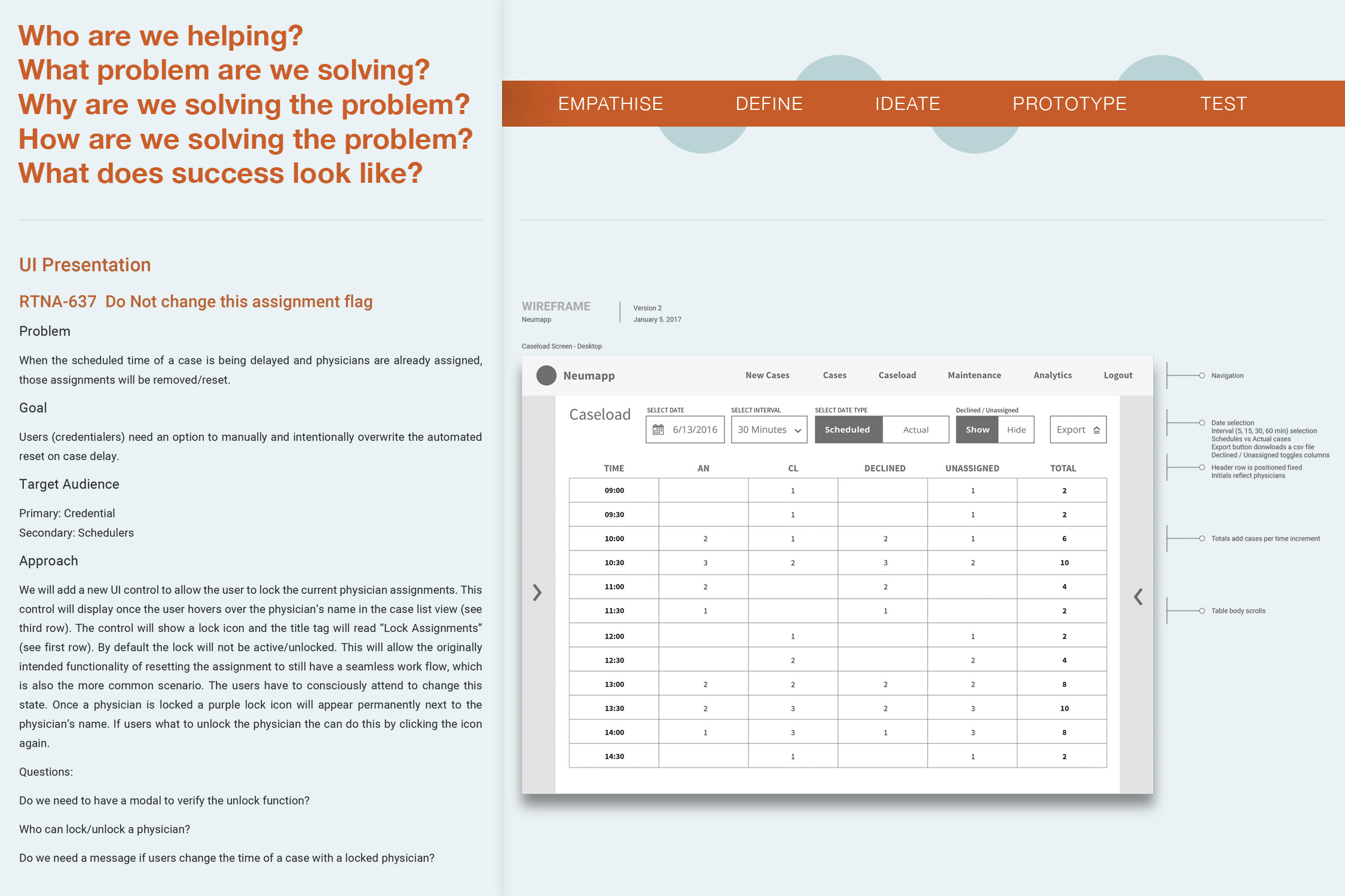
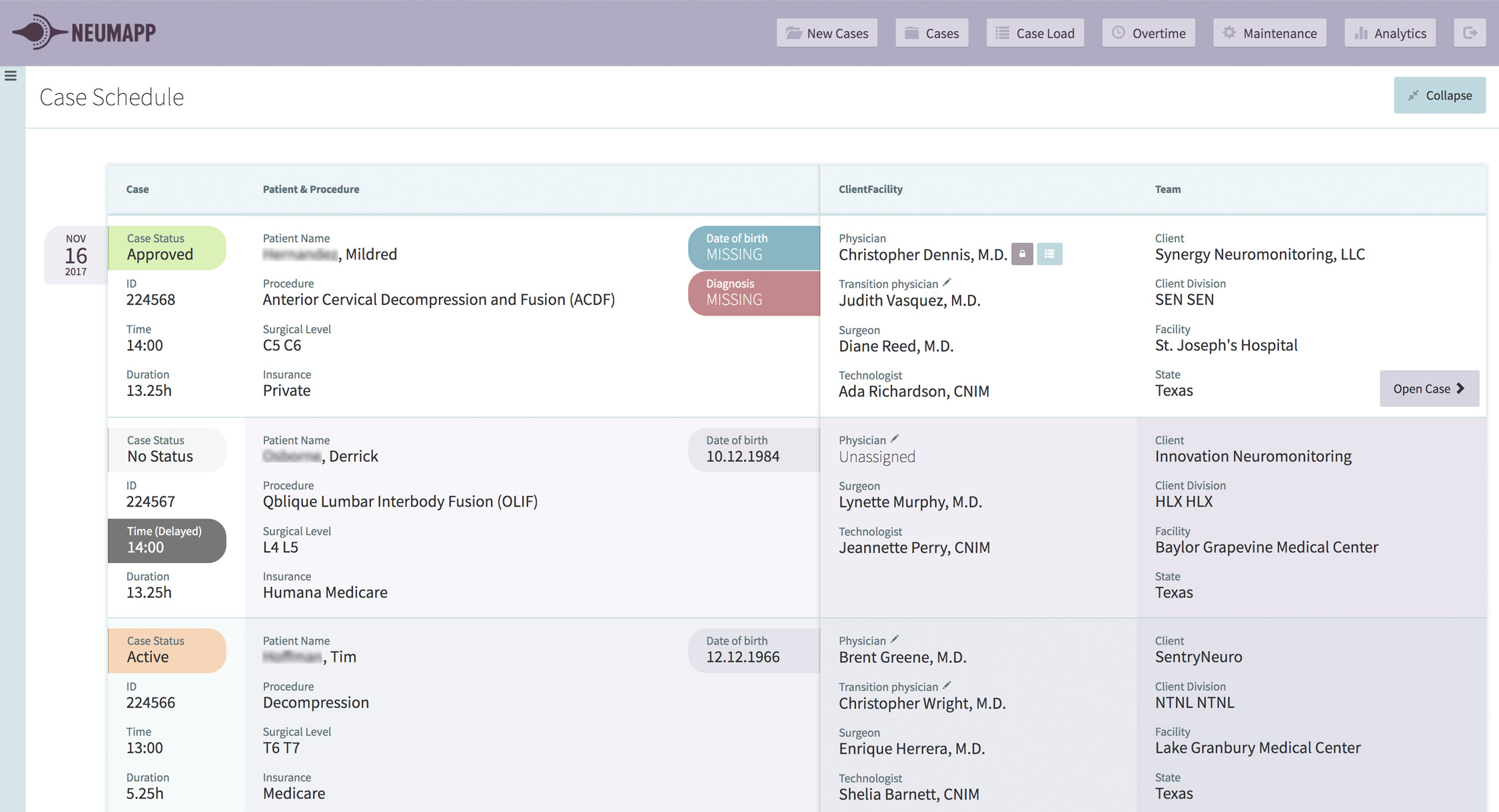
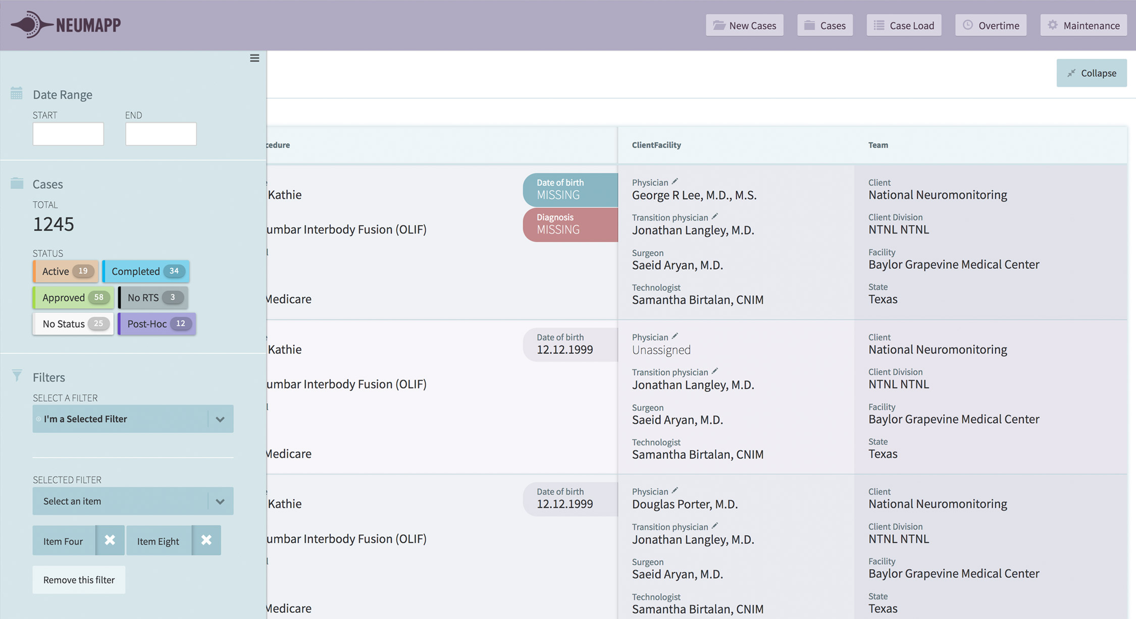
Neumapp is an application built for neurologists to remotely monitor and oversee patient status during neurosurgery. It is currently in use by ~50 telemedicine neurologists as well as scheduling staff and business analysts across the US. My responsibilities for this project were UX research (including user interviews and personas,) concept, front-end development, prototyping, design pitch, and logo design. The name calls to mind a mix of neurology, mapping, and application. The symbol mark combines eye and synapse. I was tasked to transform an Excel-based scheduling spreadsheet into an online scheduling system, which I scaled to include the full cycle from scheduling assignments to physician credentialing, billing, and reporting/analytics. The goals were to reduce human error by increasing ease of use. Neumapp gives an overview of case load per physician and allows for rapid resource allocation. The application was built in React, HTML5, and CSS 3. The deliverables were logo and UI design, data visualization, secure document management (including version history,) and workflow automation.

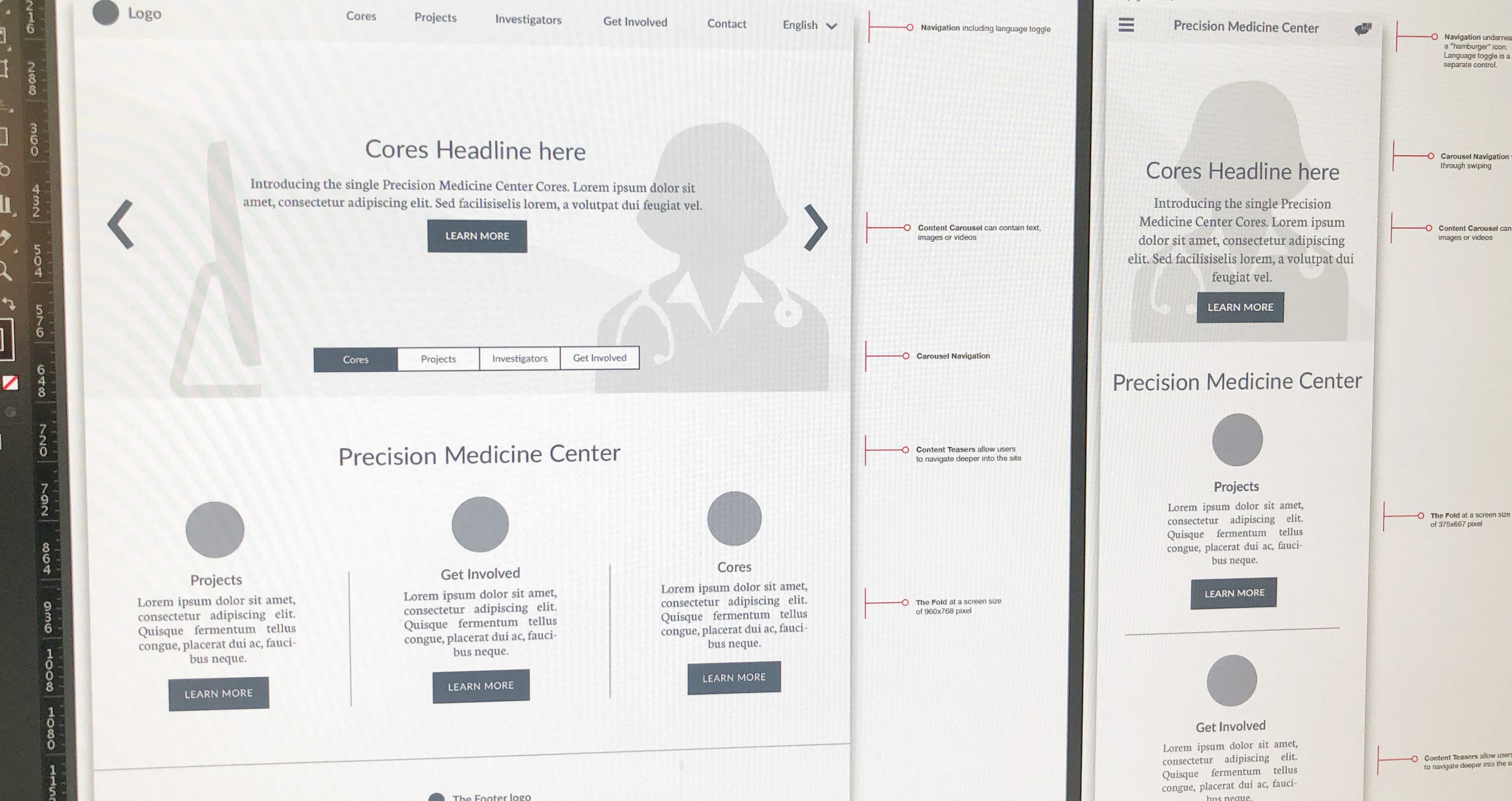
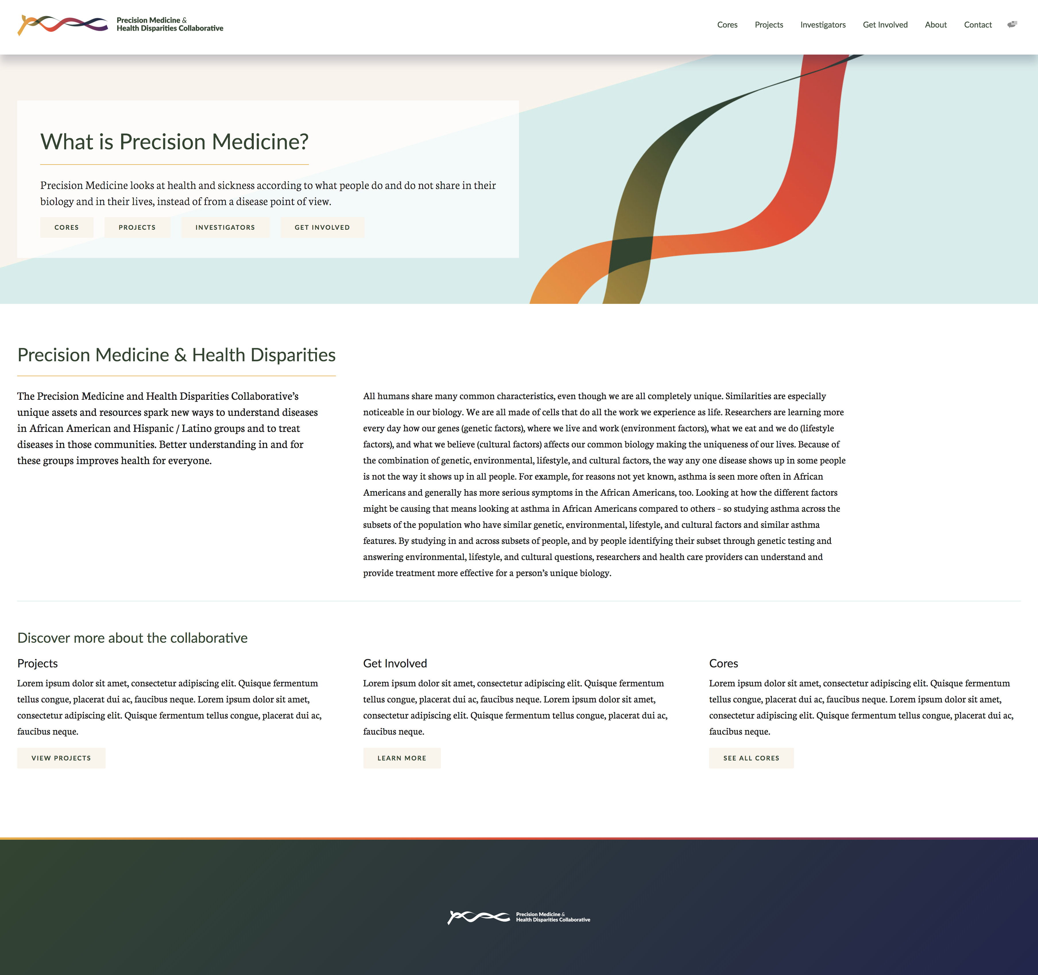
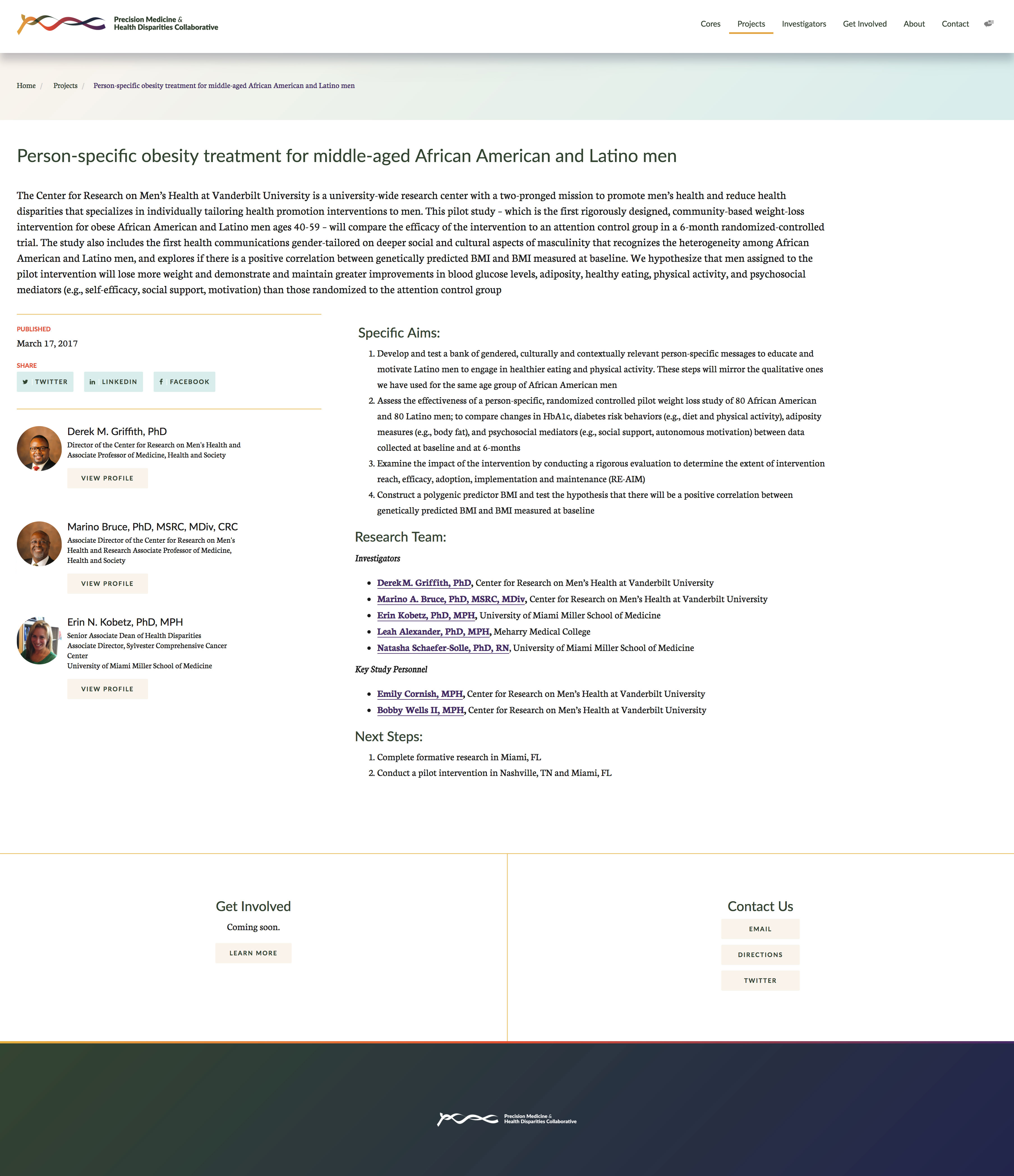
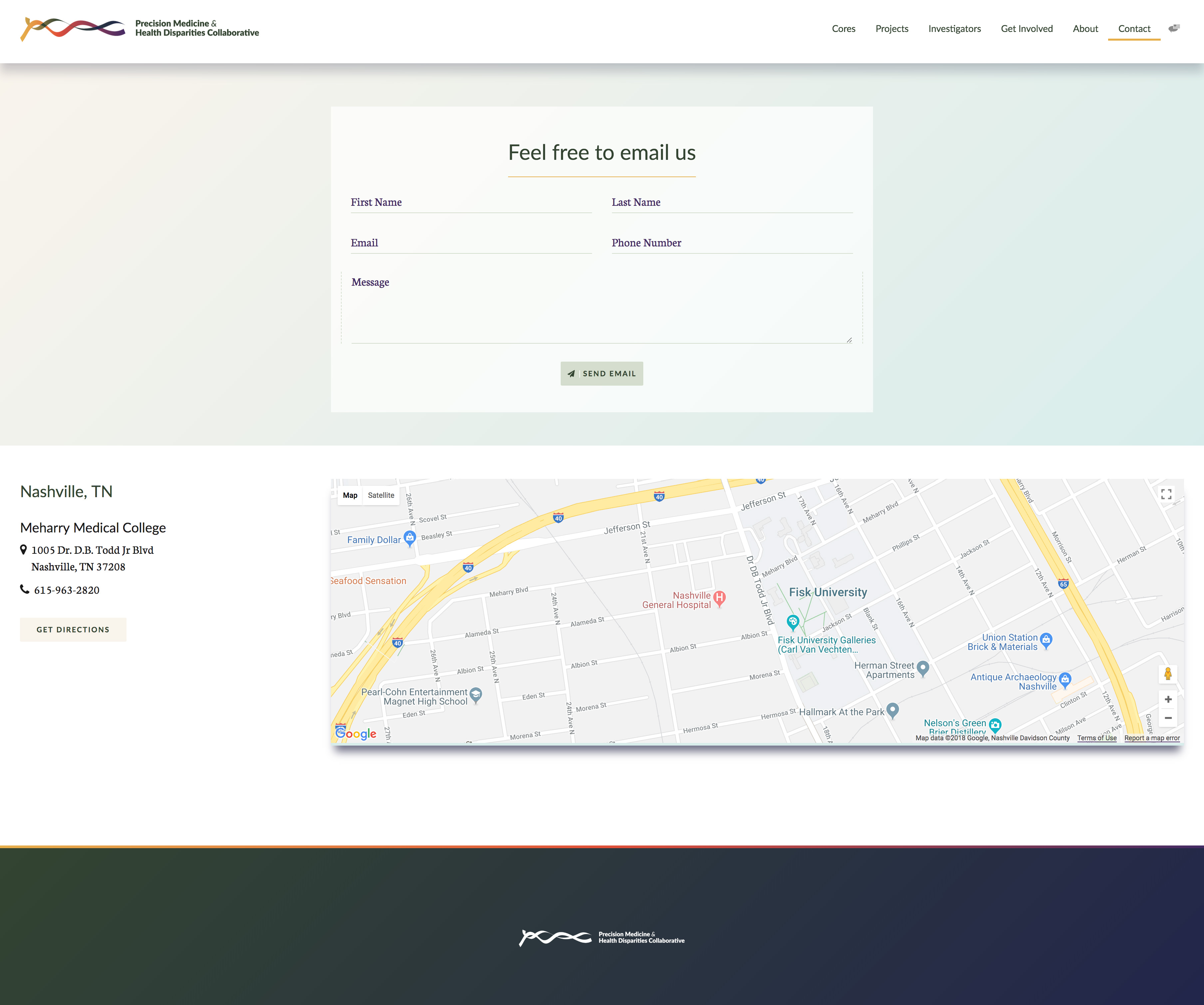
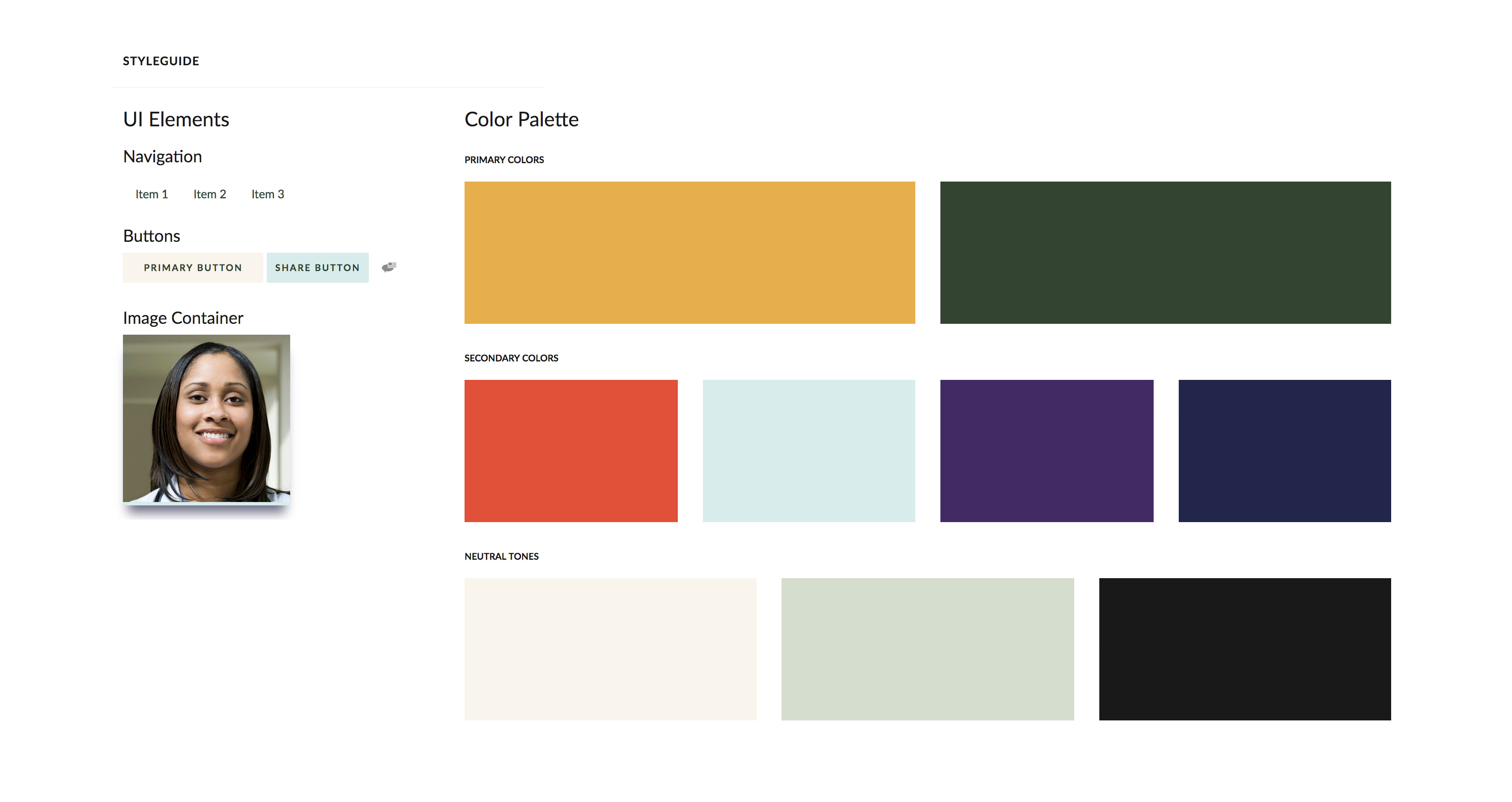
Precision Medicine & Health Disparities Collaborative
Branding / UX & UI / Web Design // Healthcare
Design System development, branding and prototyping for a multi-center healthcare collaborative.
Researchers from Vanderbilt University Medical Center, the University of Miami and Meharry Medical College launched the Vanderbilt-Miami-Meharry Center of Excellence in Precision Medicine and Population Health. I was tasked to create a Design System as the foundation for the brand so that all communication vehicles could follow the established brand to create a holistic experience. Branding is the perceived emotional corporate character in its entirety. This branding symbolizes diversity, connectivity, humanity and science through its organic shapes, color gradients and asymmetry. The logo is the symbol that universally identifies individual brand pieces. Consistency is essential for effective brand recognition and user acceptance. This logo was recognized with a Graphic Design USA Logo Award in 2017.
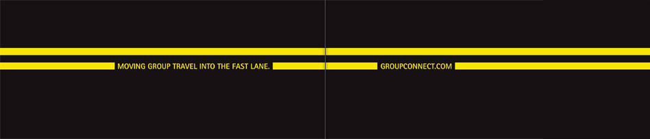
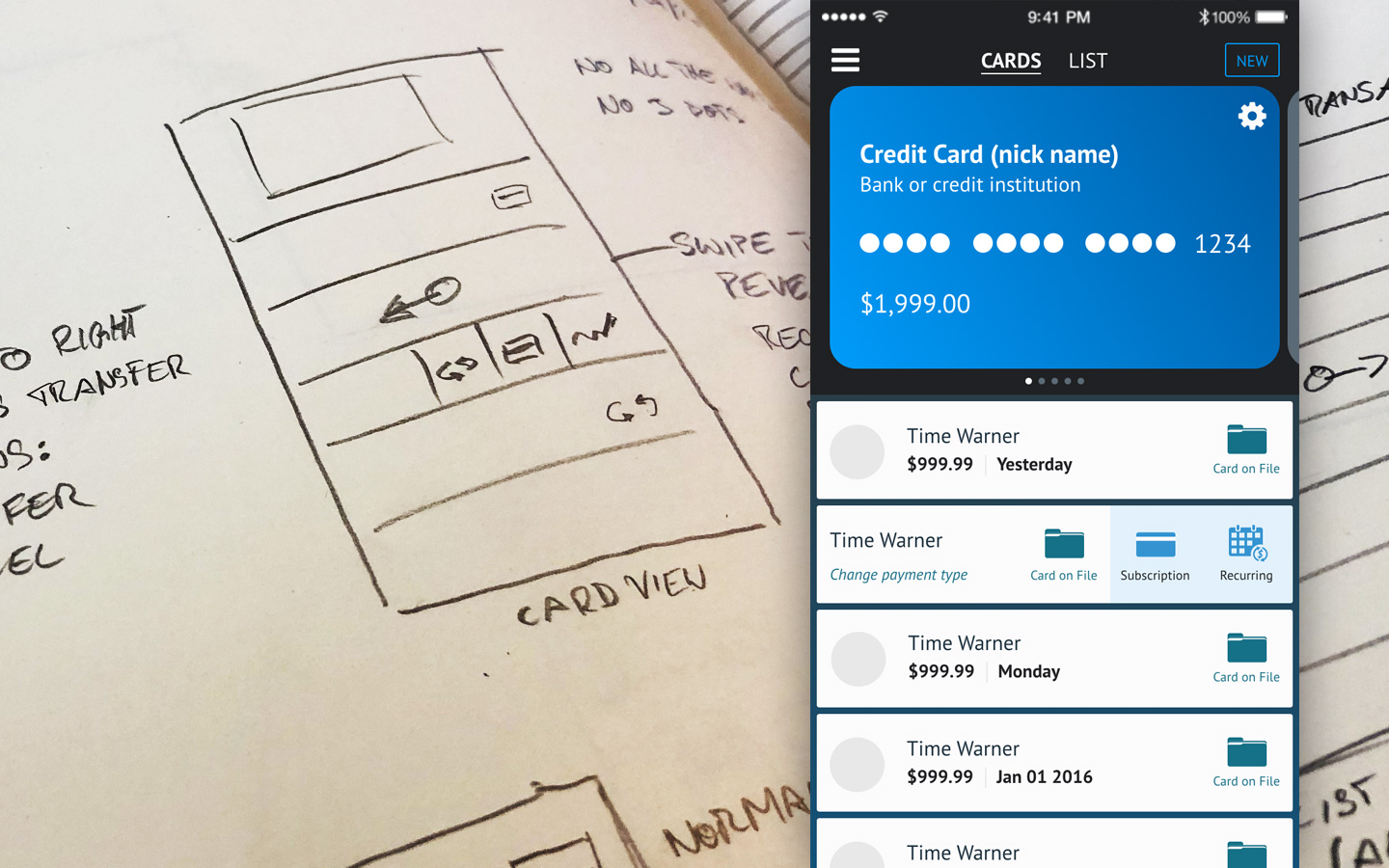
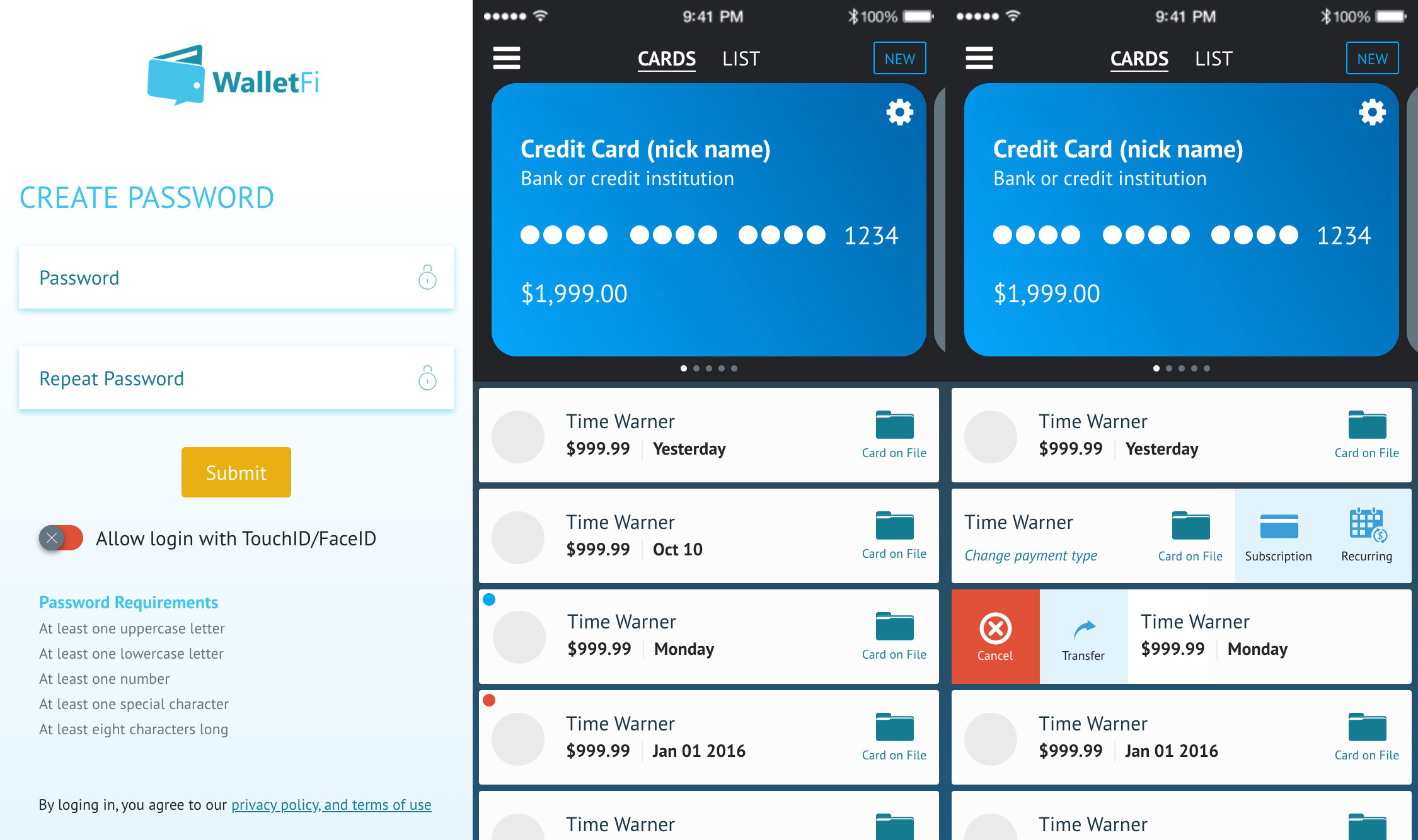
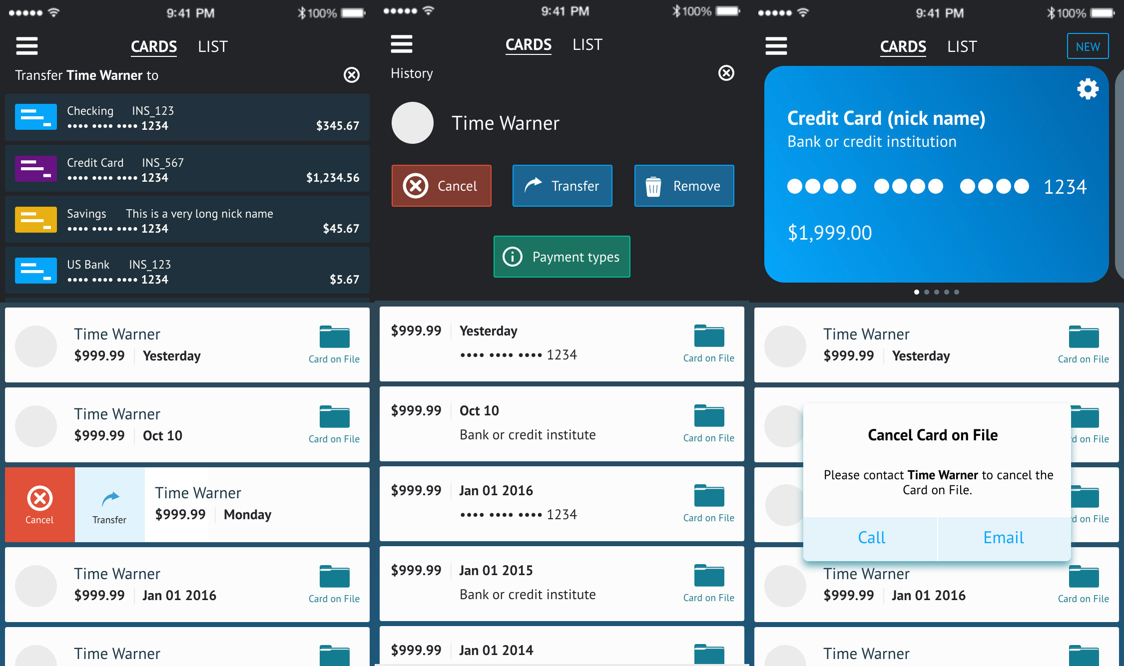
WalletFi mobile app
UX & UI / Prototype // Fintech
User-interface design and prototyping of a financial technology mobile application.
The task was to improve a partially existing design and user-flow of an iOS application. WalletFi allows users to proactively manage recurring payments. My assignment included all stages of the SDLC including discovery phase, wireframes, prototype and testing. The UI design included research of lifestyle photography, icon design and crafting of a color scheme that harmonizes with existing colors. The UX of a financial application has to carefully strike a balance between easy-to-use and trustworthy/serious. Besides the visual elements, I also worked on gestures that are distinct to mobile apps.
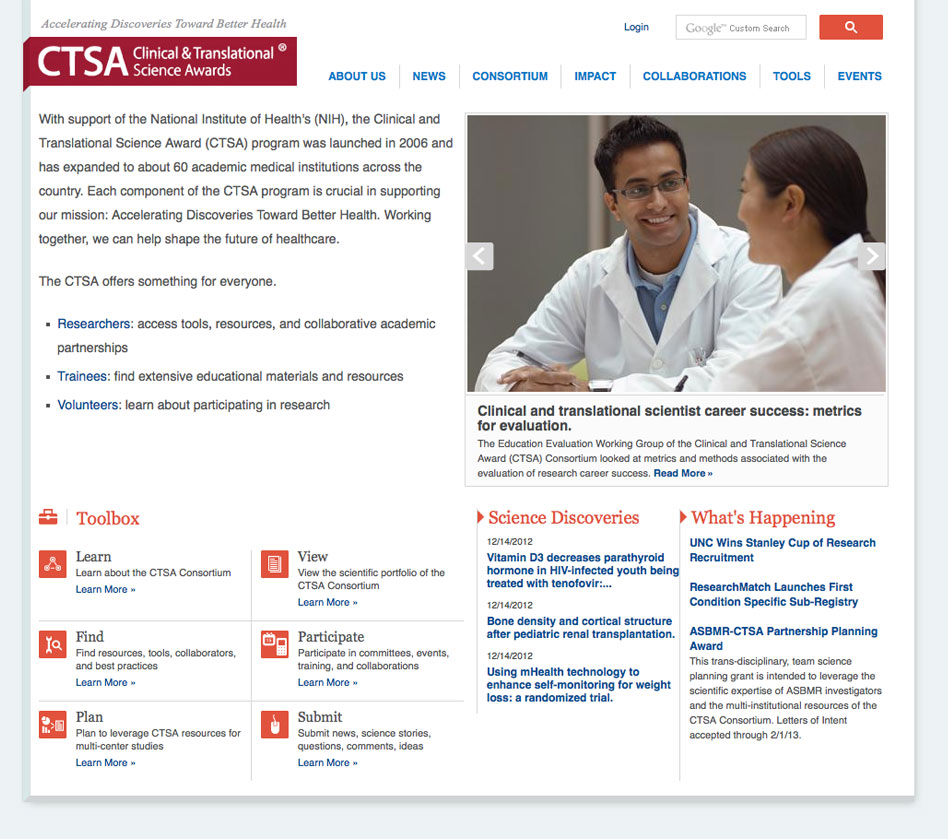
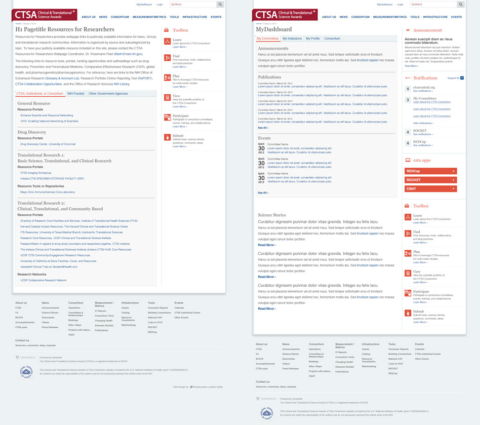
ctsacentral.org
Art Direction / Web Design / UX & UI // Science and Education
Art direction and web design for a science collaboration portal.
Clinical and Translational Science Award (CTSA) program is Drupal website powered by Vanderbilt University that allows scientist across the US to collaborate and also share information with the public. The light color scheme of the website allows for the content to stand in the foreground. The modern look and feel is reflective of the foreward thinking nature of science. This project's UI design included custom iconography, button design and logo development.
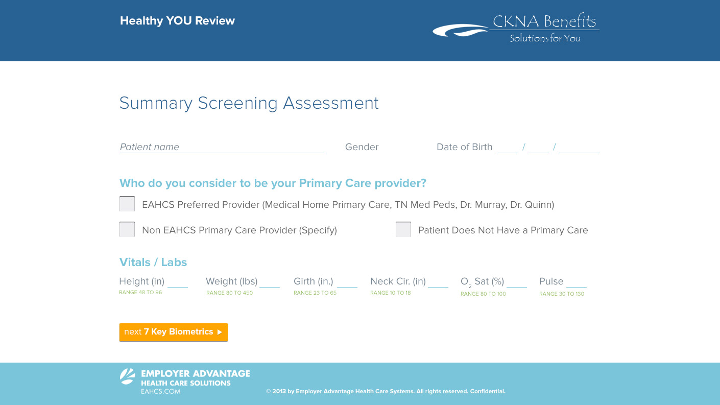
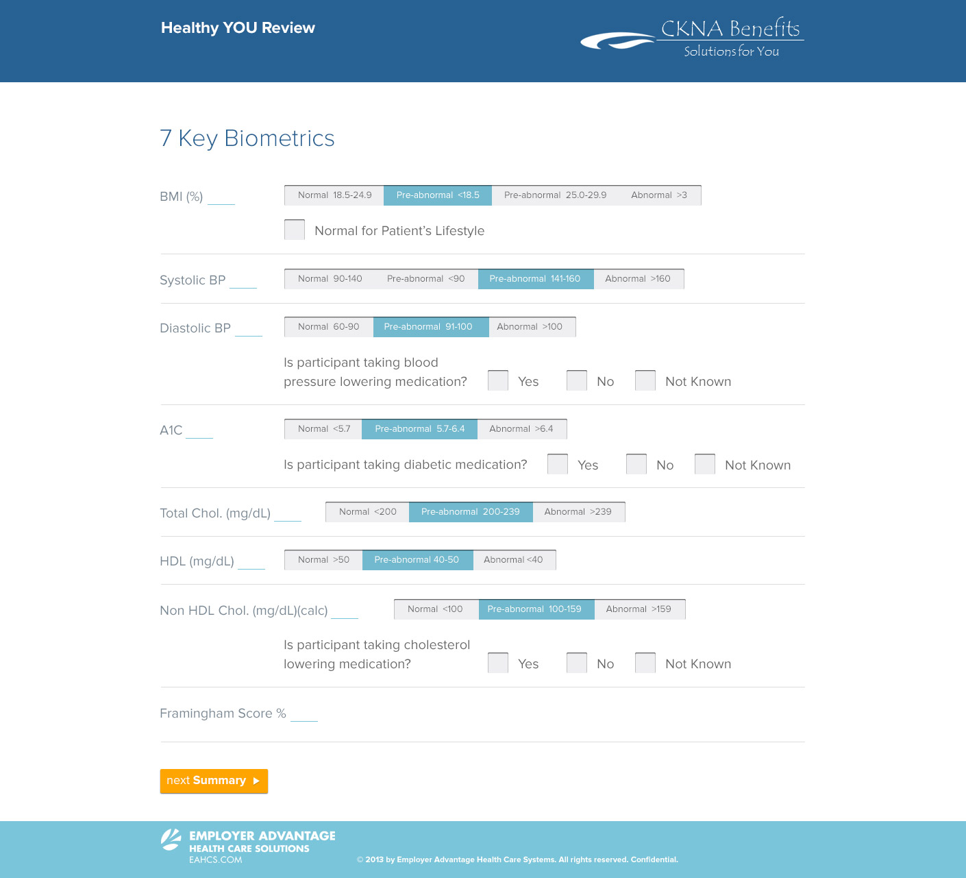
Employer Advantage Health Care Solutions
UX & UI / Web Design // Healthcare
Design and prototyping of an interactive patient questionnaire.
EAHCS uses this multi-step questionnaire application for initial patient evaluation and as a first user setup. My assignment was to design a customizable UI that could be used as a white-label solution for EAHCS clients. The color scheme and typography allow for easy data entry and therefore increase data accuracy. I developed an Atomic Design System and a prototype with several initial screens. This allowed other team members to build out the entire application.
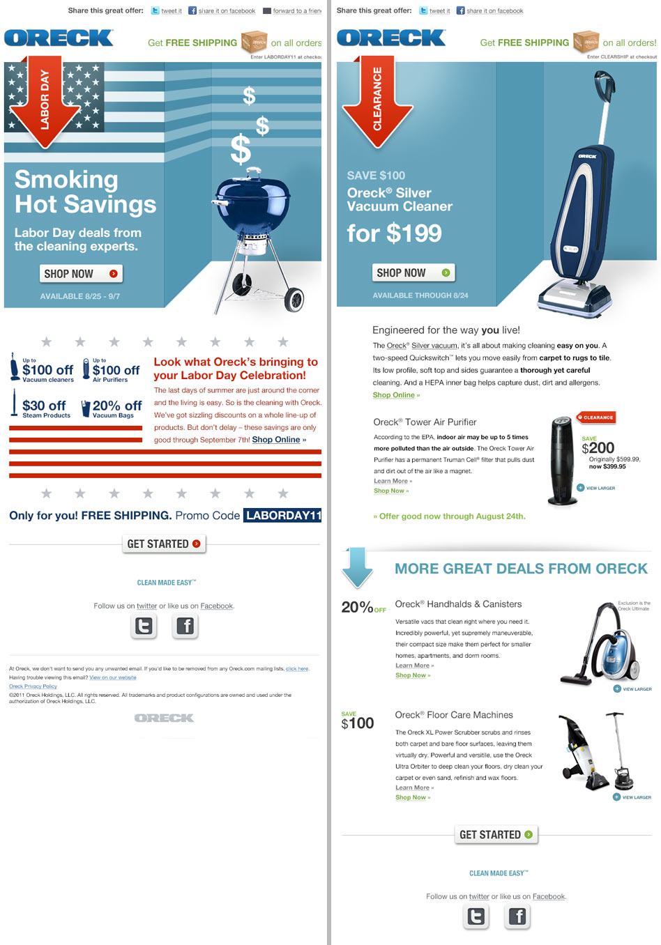
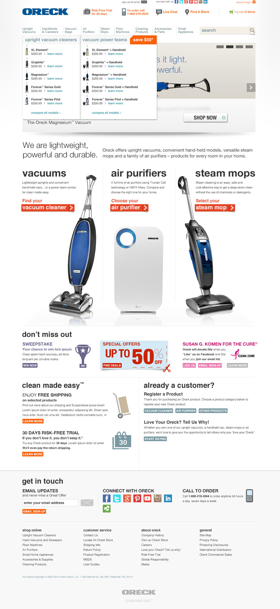
oreck.com UX & Web Design
Art Direction / Web Design / UX & UI / Copywriting // Ecommerce B2C
Redesign of Oreck's corporate website
The new design showcases the products in a bold way. Content is arrange in a user-friendly layout and design elements and typography treatment support this user-friendly approach. The pages are separated in vertical spaces. This eliminates the fold and gives the user relevant content even after scrolling. The site was build on a Demandware platform. The custom icons and newly developed design patterns are all part of a new UI that enhances the overall user-experience on the website.
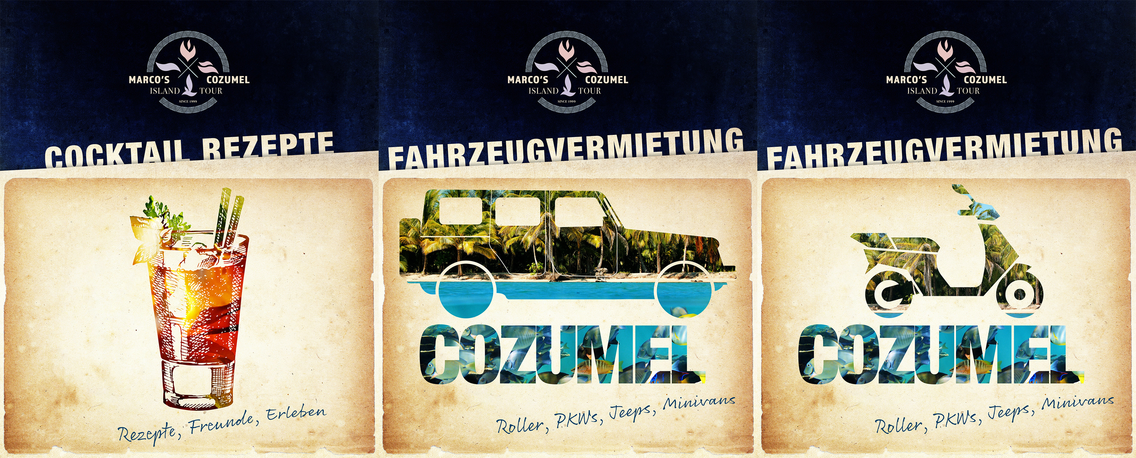
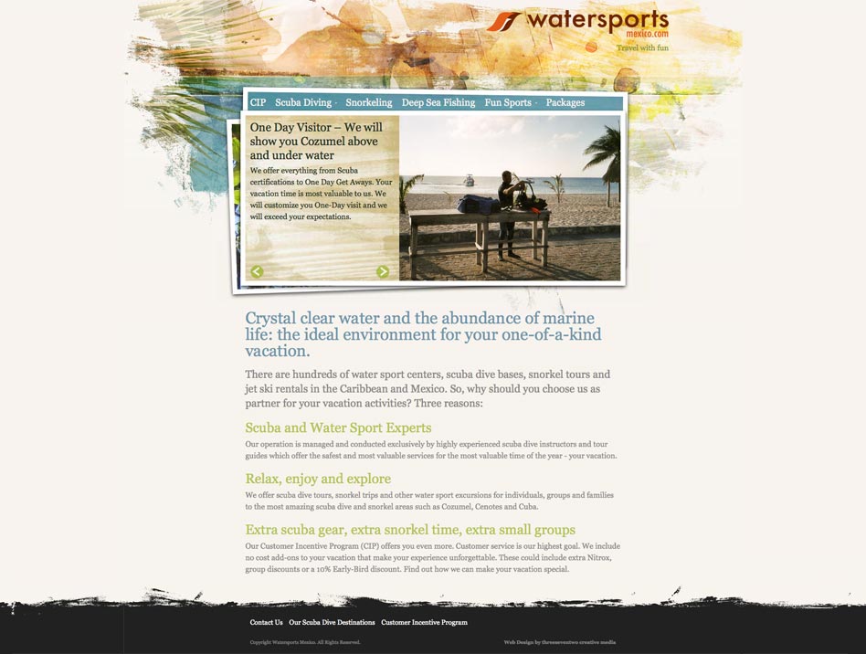
Watersports Mexico website
Art Direction / Web Design / UX & UI / Copywriting // Travel Industry
Art direction and web design of a WordPress website for Watersports Mexico offering scuba diving, snorkeling and other travel services to visitors of Cozumel Mexico.
The warm color scheme of the web design is reflective of the friendly character of the business. Large photography and bold typography lead the visitors of the website to areas of interest. The grid layout of the web design allows for the information to be presented in a clear and easy to read way. This website was recognized with a Graphic Design USA Web Award in 2011.
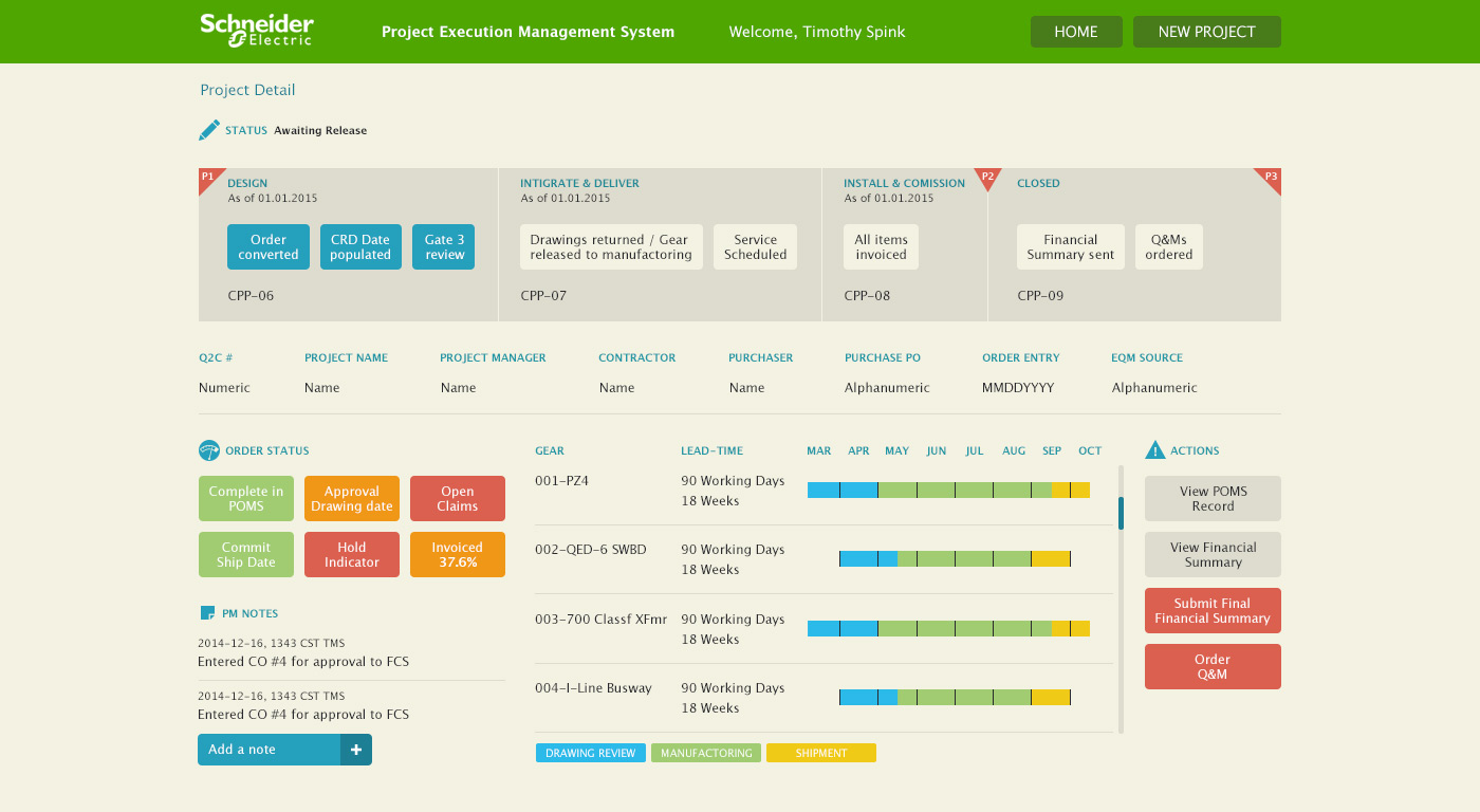
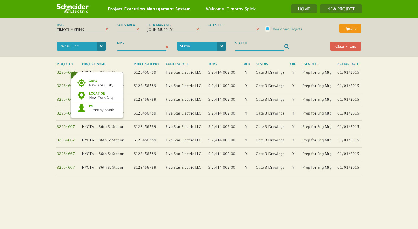
Schneider Electric Project Management System
UX & UI / Web Design // Manufacturing
User-interface design and application design for an internal project management system.
The objective of this project was to create an initial screen design and a collection of design artifacts. These artifacts will be used to create additional screens and interface modules. The application gives project managers detailed insight into resource allocation, supply-chain management, time lines and project statuses. The goal is to deliver a holistic and data-driven view to allow for better decision making.
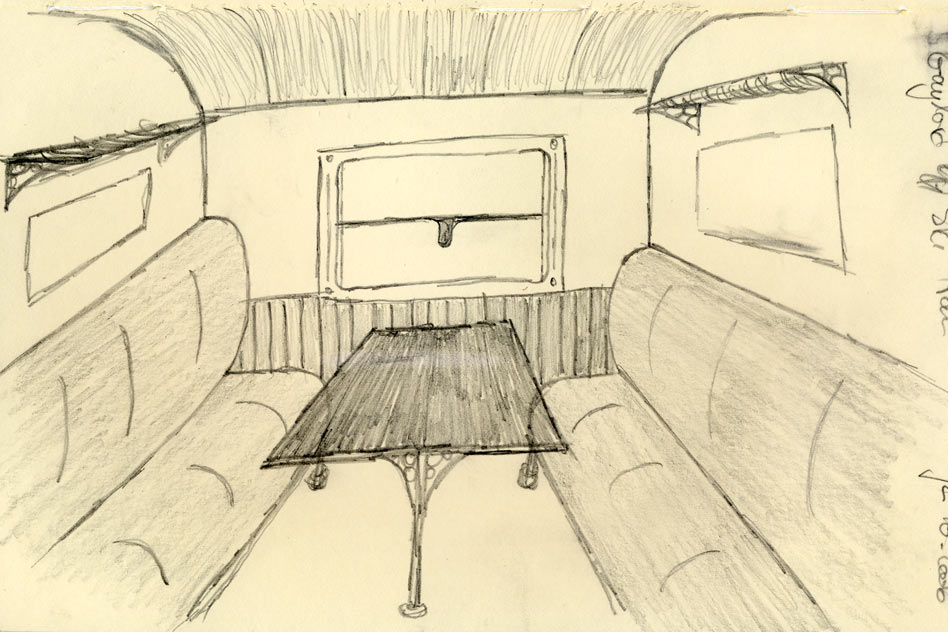
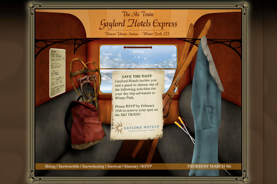
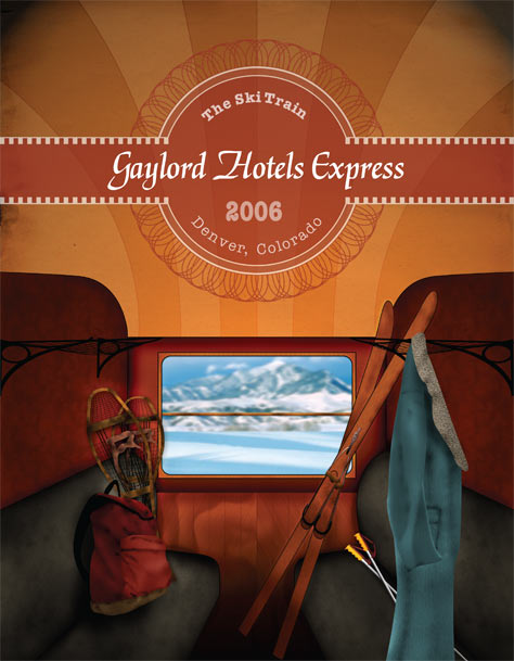
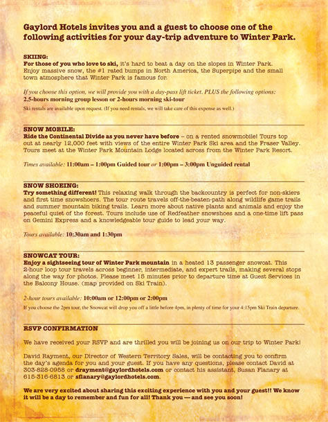
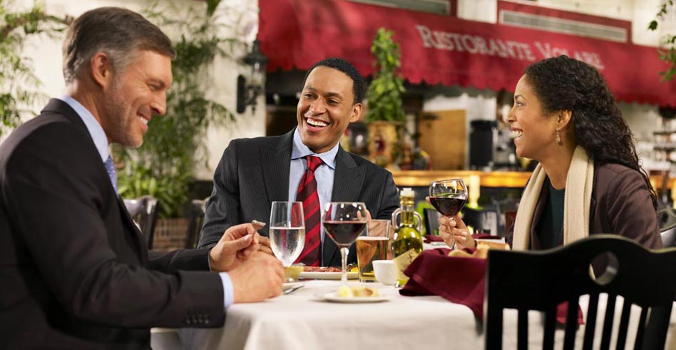
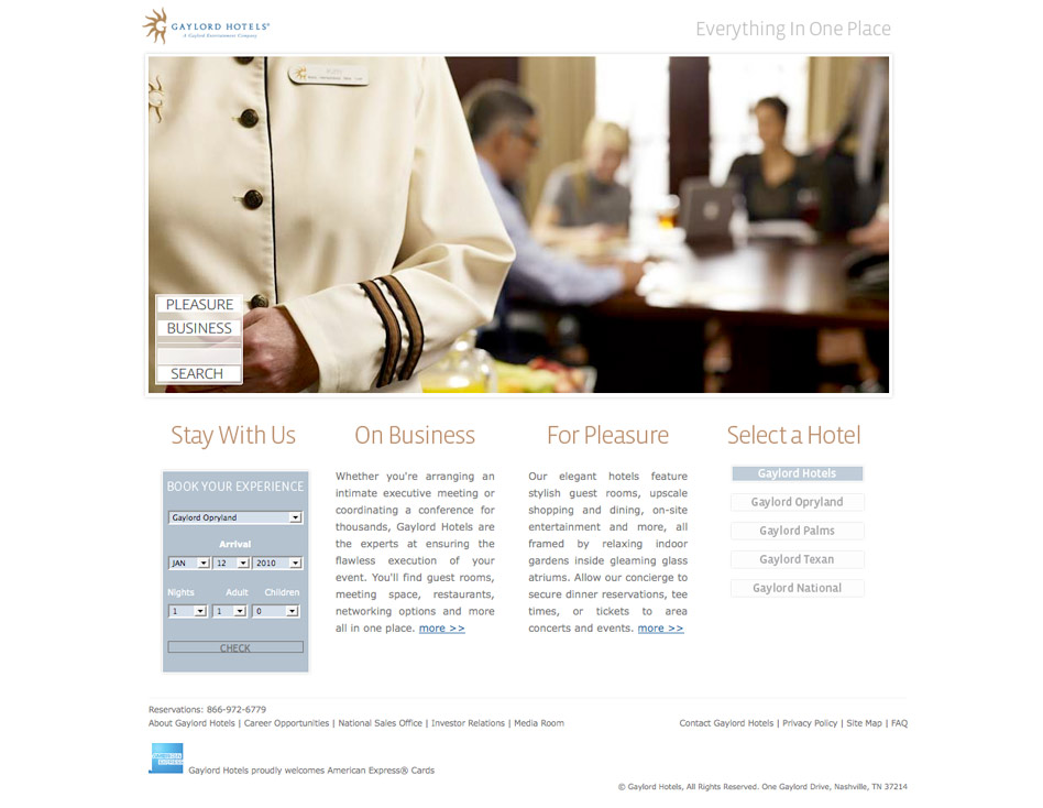
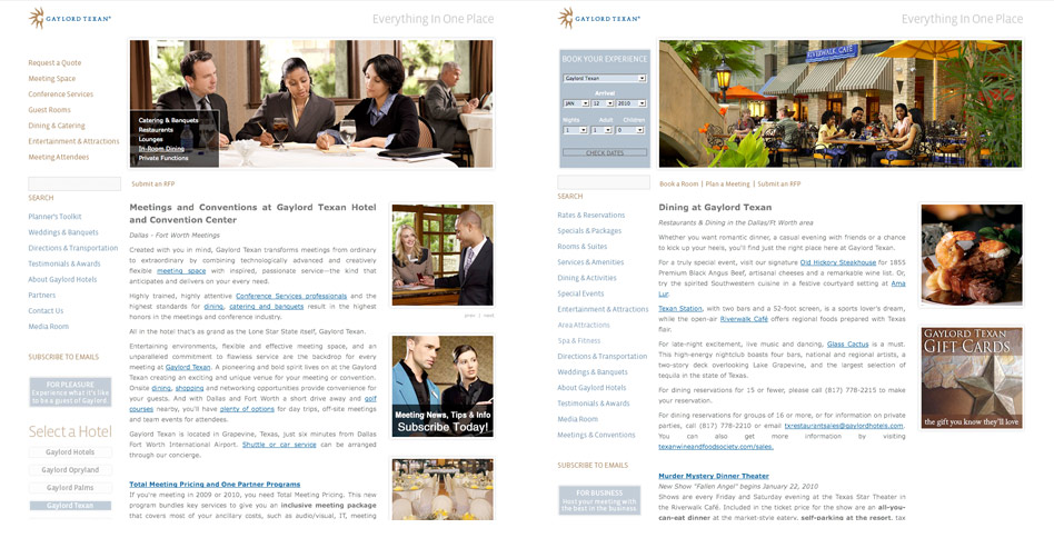
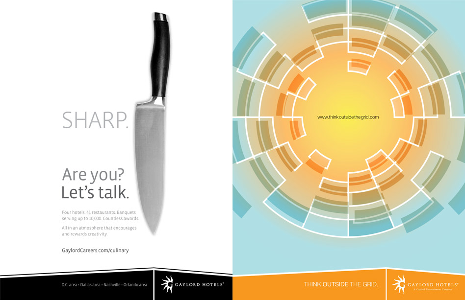
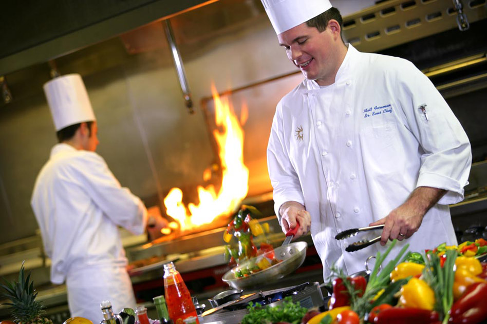
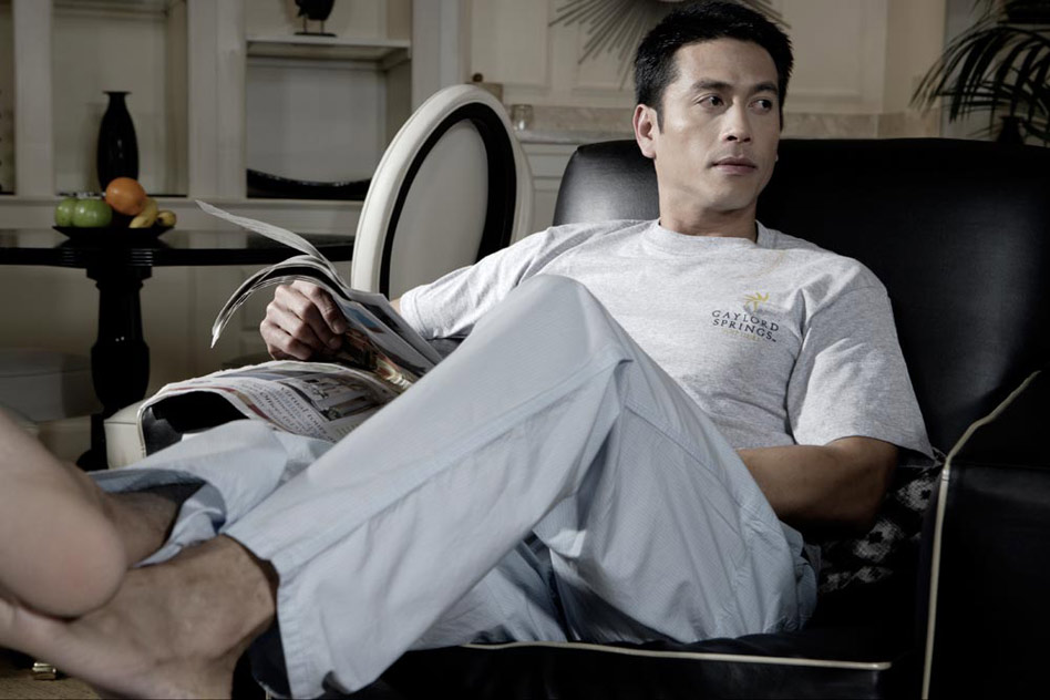
Gaylord Hotels rebranding
Art Direction / Branding / UX & UI / Copywriting // Hospitality and Travel Industry
Art direction, graphic design and web design for marketing materials and sales collateral for the brand Gaylord Hotels and the individual properties.
This rebranding included designing ads and campaigns, directing photoshoots, defining a brand voice and creating the concept and design of a new website as well as small sites for individual venues. The objective was to create one holistic user-experience. For the recruitment ad for the Food & Beverage department I crafted the headline "Sharp. Are You? Let's Talk." as well as the overall ad concept. The "Think Outside The Grid" campaign was created to communicate that Gaylord offers more than can fit on a spreadsheet.
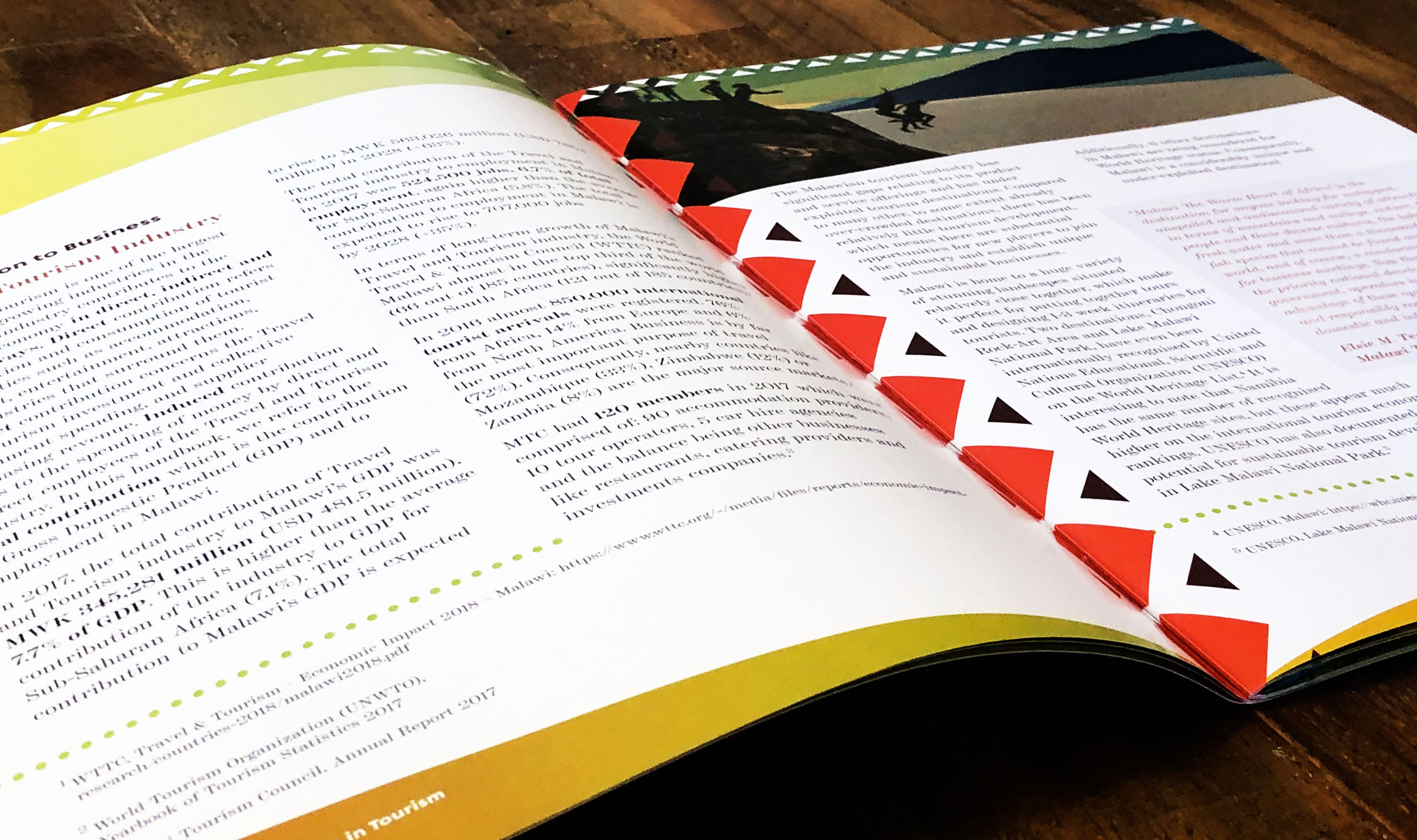
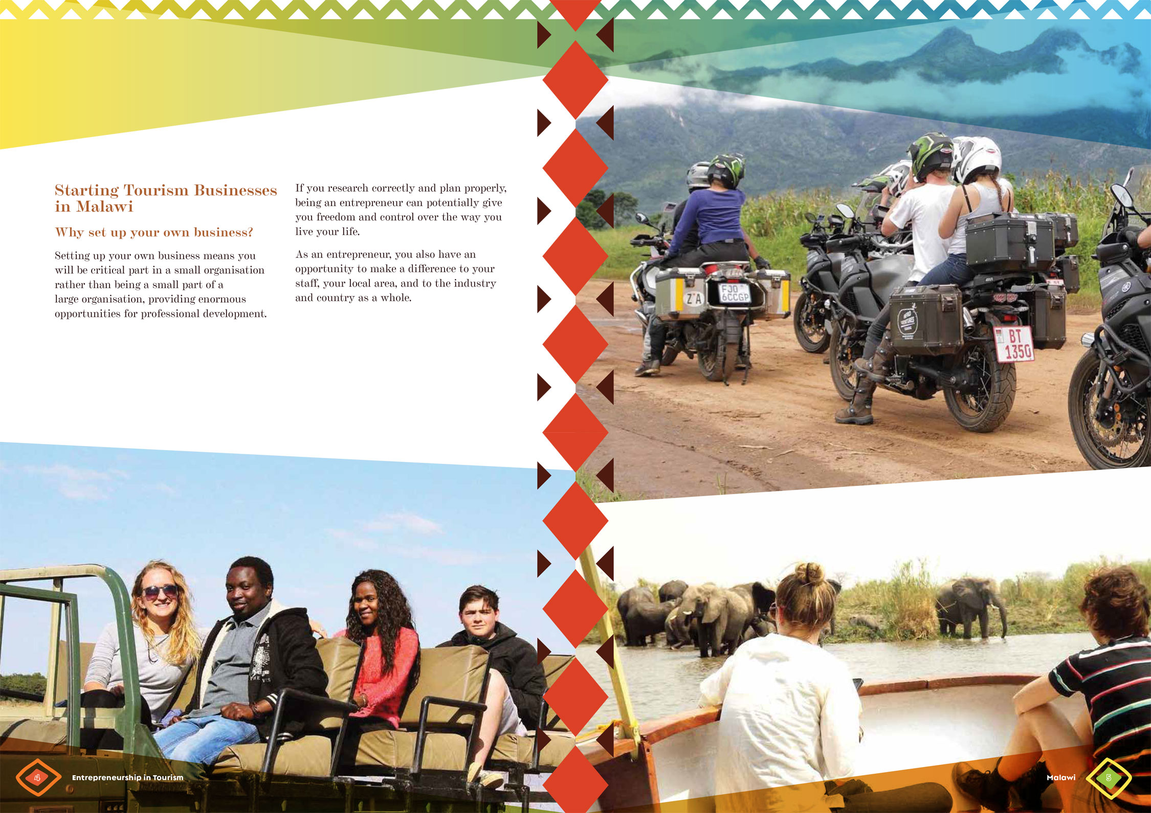
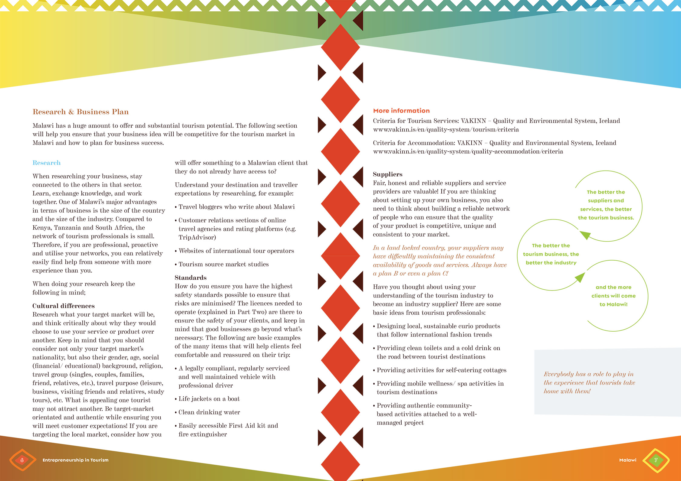
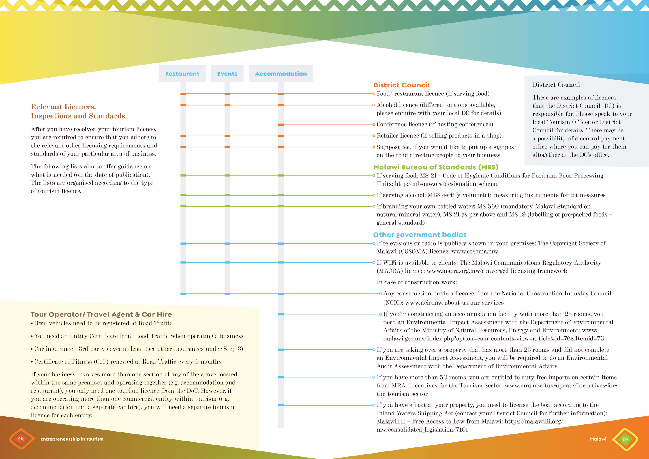
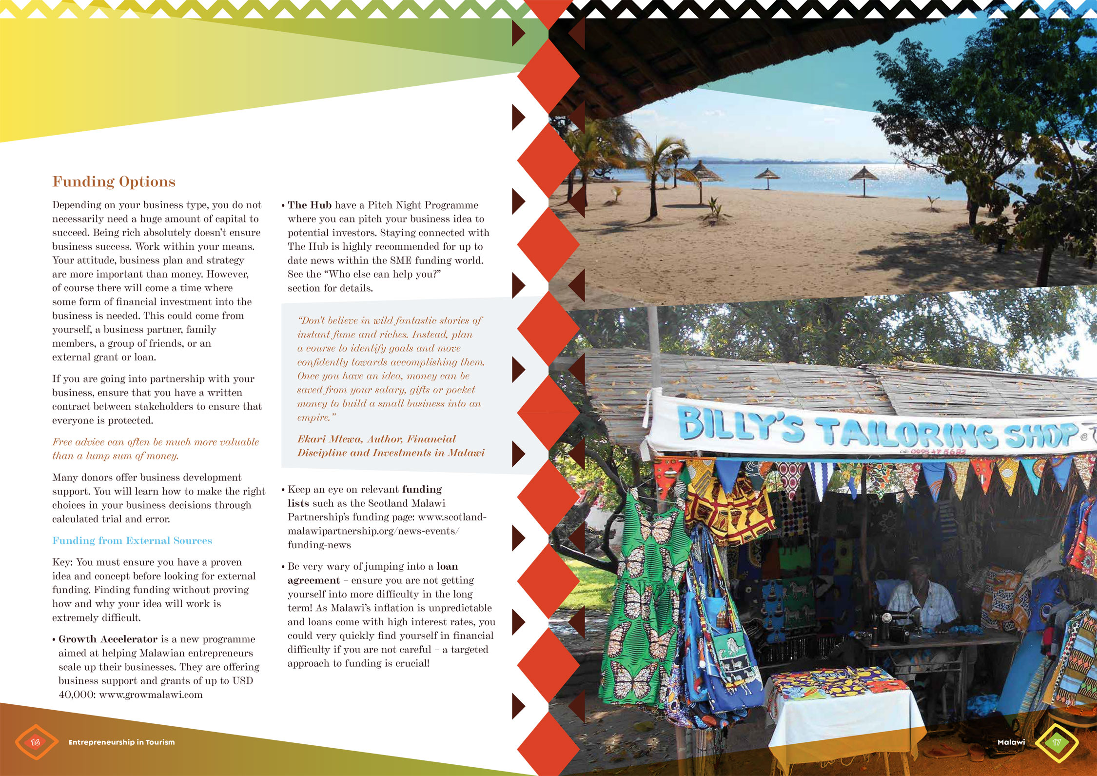
Malawi Tourism Council Brochure
Art Direction / Graphic Design // Hospitality and Travel Industry
Collaboration with teams in Germany, the UK, Malawi, and the US.
For this project, I was design lead for an international team creating an informational brochure on entrepreneurship in the tourism/hospitality industry. My tasks included layout and design, data visualization, photography research, project supervision, and bilingual project consulting. The format is a 20-page saddle-stitched brochure. The first batch was offset printed, but was also requested to be able to be digital/printed onsite. The deliverables included a print version as well as a downloadable online version with interactive links.
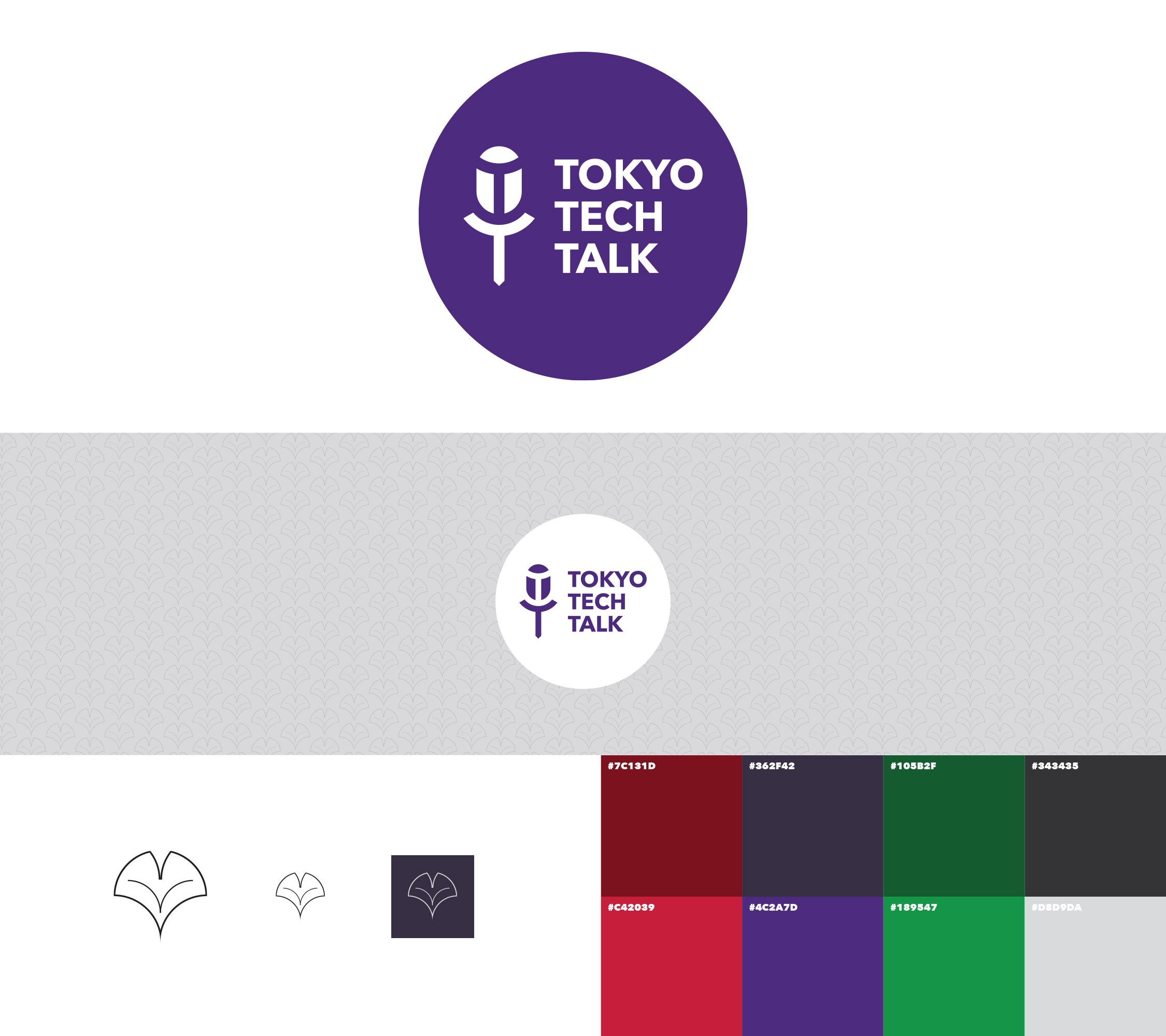
Tokyo Tech Talk
Creative Direction / Branding / Graphic Design // Technology
Branding and design standards for a Tokyo-based podcast.
Tokyo Tech Talk is a Tokyo-based podcast about trends, gadgets, and developments in the tech world. The branding and look/feel is a nod to traditional Tokyo colors, and Japanese- and Swiss-style simplicity. The simple shapes of the logo remain identifiable even in small format. The bold yet warm color scheme allows for impactful statements in design. The use of the gingko leaf symbolizes the associated memory and cognition benefits, as well as tying back to the location of the podcast. Deliverables included logo (symbol and word marks,) color scheme, logo versions for both white and other backgrounds, and background pattern design.
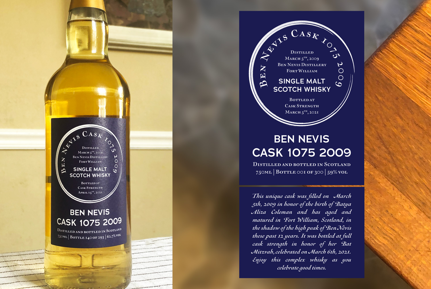
Ben Nevis Bottle Label
Graphic Design / Packaging
Custom label for a unique Single Malt Scotch.
This custom bottle label was designed for a limited edition private selection of a Single Malt Scotch, the object of which was to be a ten-year-long planned tribute in honor of the client’s daughter’s Bat Mitzvah. The blue and white duotone logo reflects traditional colors of the Jewish faith, the deep blue of which plays against the amber of the whisky. The dynamic circle was hand-drawn to represent the ideals of life, family, friends, and tradition. It is also reflective of the single barrel origin of this limited, cast-strength Scotch. The sans-serif typeface is modern, yet classic. Certain elements commonly used in Scotch label design treatments- such as brown/red color schemes and textures of parchment or wood- were avoided to emphasize the unique nature of the product. I collaborated on this project with my US client and the manufacturer in Scotland.
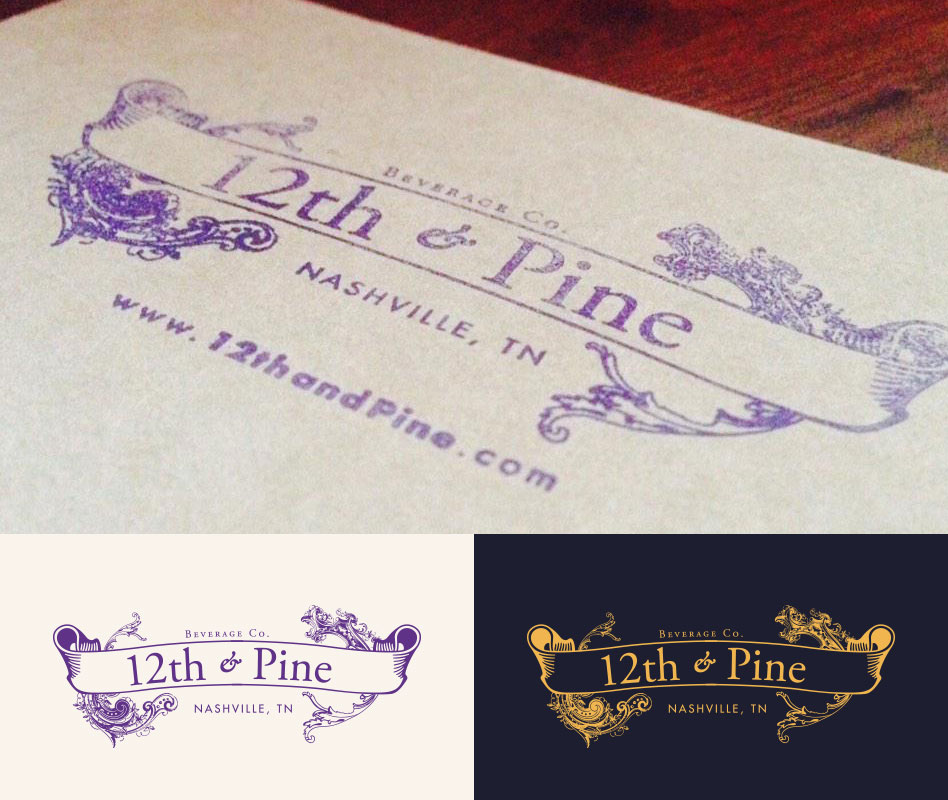
12th & Pine Branding
Creative Direction / Branding / Graphic Design // Retail - B2C
Branding and marketing of a Nashville-based wine and liquor store.
12th & Pine Beverage Company located in the Nashville neighborhood the Gulch. The store offers wines, spirits and craft beers. The vintage logo design and warm brand colors create an inviting and personal look and feel. Using the logo as a stamp on marketing and merchandise collateral underlines the personal touch.
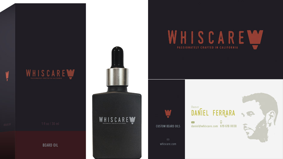
Whiscare Branding
Creative Direction / Branding / Naming // Retail - B2C
Brand development of a beard oil company based out of San Diego.
Whiscare's prodcut line completes skin care for today's man. The initial task was to create a unique brand name, logo design and all packaging. The design was recognized with a Graphic Design USA Package Design Award in 2015.
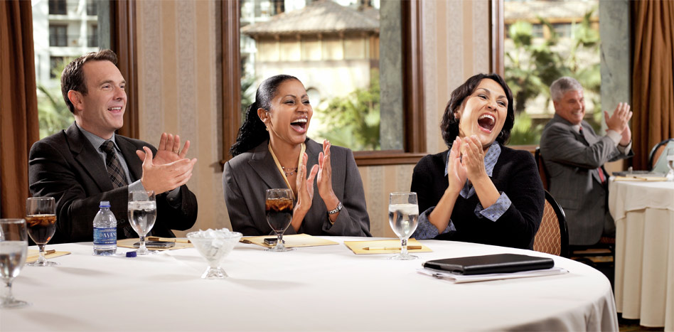
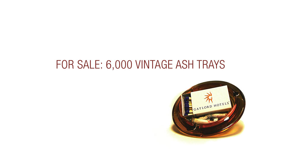
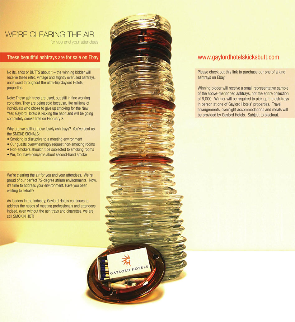
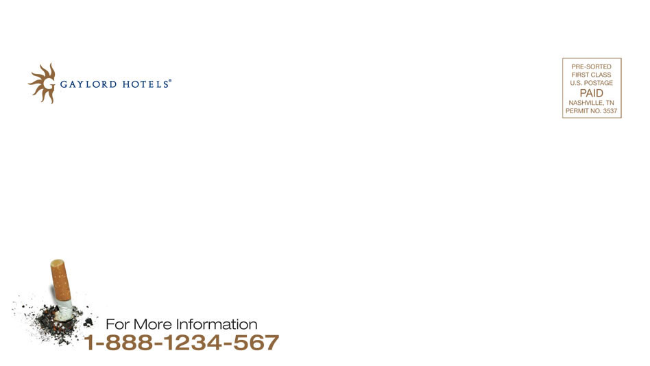
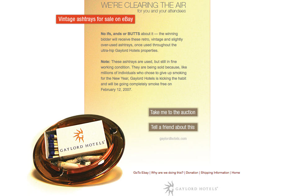
Gaylord Hotels Kicks Butts
Art Direction / Graphic Design / UX / Copywriting // Hospitality and Travel Industry
Art Direction and graphic design for a multi-piece marketing campaign announcing Gaylord Hotels' non-smoking initiative.
We utilized traditional and online marketing tools to engage the target audience. The idea was to create more than a simple press release and to use "Gaylord Hotels Kicks Butts" as a branding slogan. The overall voice was as simple and direct as the visuals. Clean design for clean air. The idea of an online auction created very positive media and clients responded with excitement. The proceeds of this auction were donated to the American Lung Association. This piece won an ADDY Award in 2008.
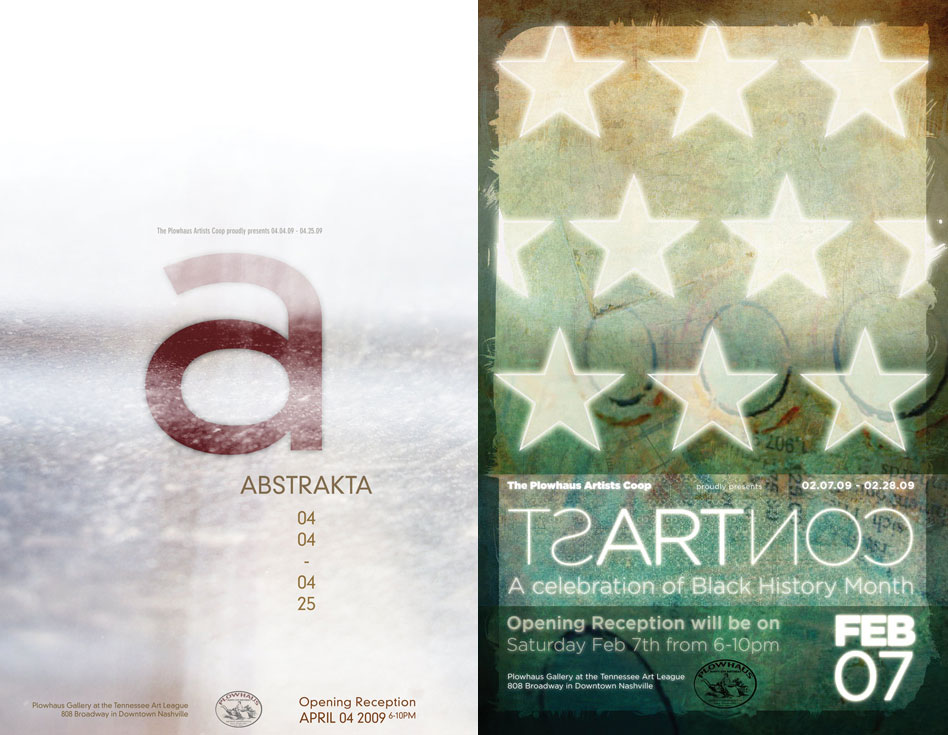
Plowhaus Poster Design
Art Direction / Graphic Design / Naming / Copywriting // Non-Profit
Art direction and graphic design of a print marketing pieces in form of event posters for the Plowhaus Artists’ Cooperative that invite to a Nashville art show.
In order to reflect the entire show the design of the posters could not be a pieces of art themselves or mirror a particular artistic style. Next to the art direction and graphic design I also had the great opportunity to name the shows. The reader's attention is drawn to the posters trough an unusual typography treatment for the title. The Abstrakta poster won AIGA Case Award in 2009, Silver ADDY Award in 2010 and was recognized at the Tenn Show in 2010.
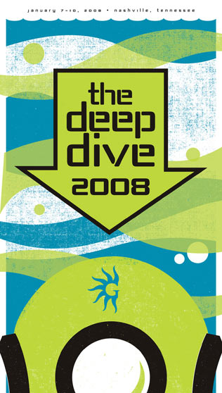
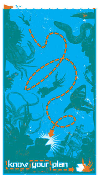
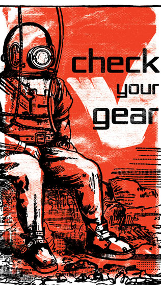
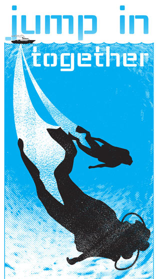
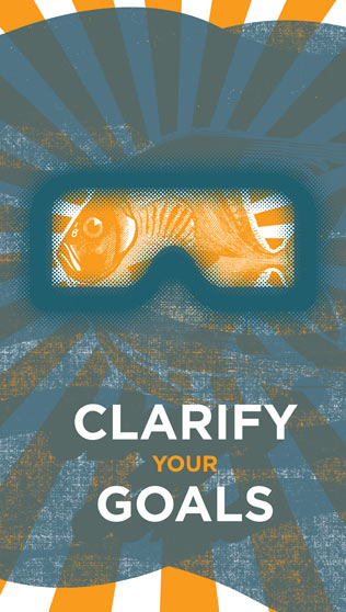
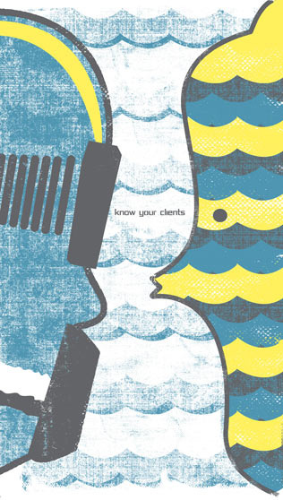
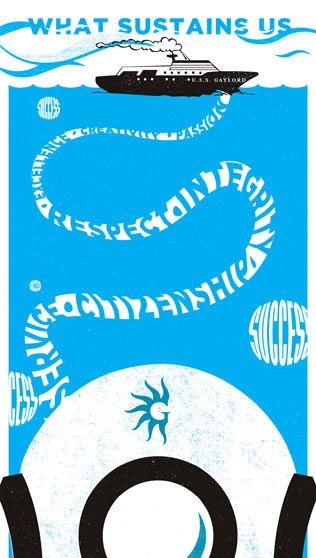
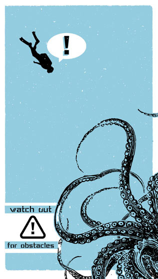
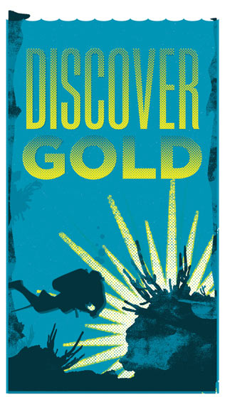
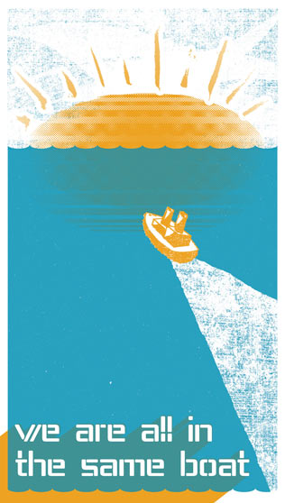
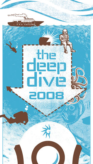
Deep Dive Posters
Art Direction / Marketing / Copywriting // Hospitality and Travel Industry
Art direction of a freelance designer and silkscreen printer to create a calendar.
Gaylord Hotels' sales team establishes an annual motto each year. In 2008 I was on the planning committee and created the new motto 'The Deep Dive'. The idea was to focus on the essentials of the brand. The idea was to communicate single cornerstone messages to the sales team and to give a monthly reminder. Each month's message was carefully planned and conceptualized. This calendar won an ADDY Award in 2009.
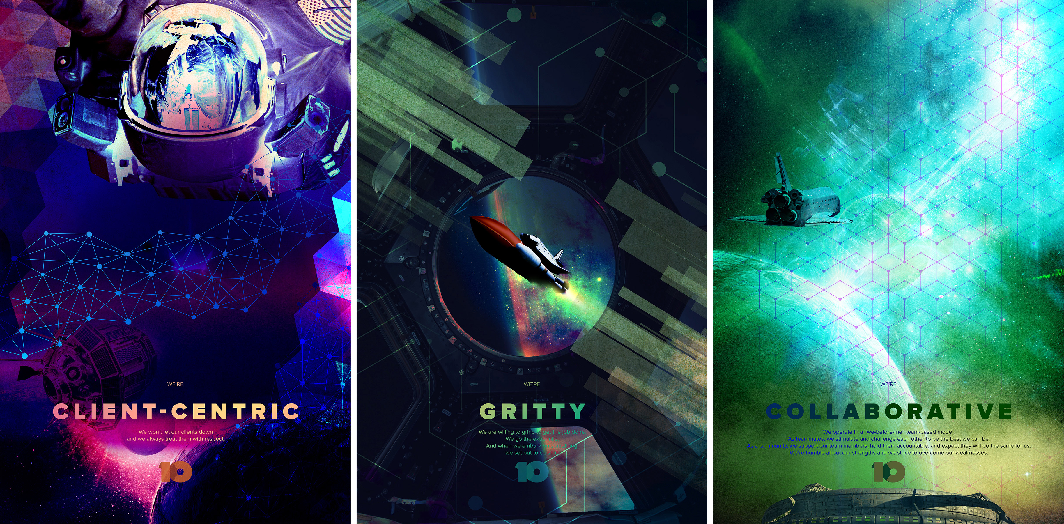
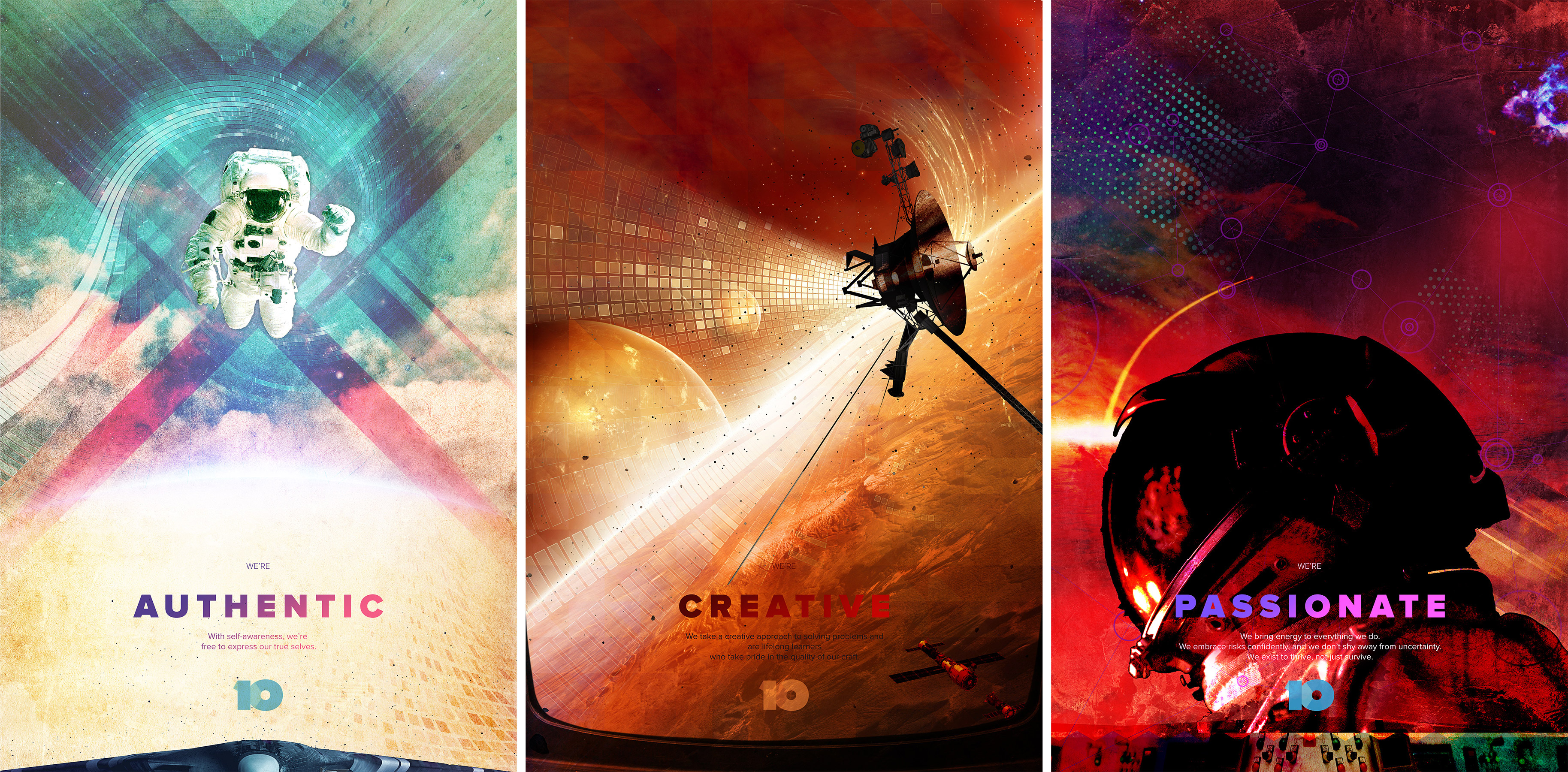
Core10 space posters
Art Direction / Graphic Design / Copywriting // Fintech
Art direction and graphic design of internal company culture posters
Core10 is a software development startup in the fintech space. As is often the case with startups, it is difficult to manifest the common culture. I was part of the team that lead this effort. In my role as design director I not only created all posters but also introduced the Outer Space theme to the team. Starting a new company has many parallels to space exploration. You work in the unknown, face obstacles as a team, and must adapt to ever-changing situations. The posters are meant to be displayed in one row so that the subtle graphic connections (color spectrum, connecting patterns) are revealed to the viewer. This poster series won a Graphic Design USA Poster Design Award 2017